Finnable
Addressing loan application pain points.
Team
Role: Lead Designer
Collaborating team at Finnable: ( Marketing, PM, Leadership )
Managing team: UX/UI Designer
Background
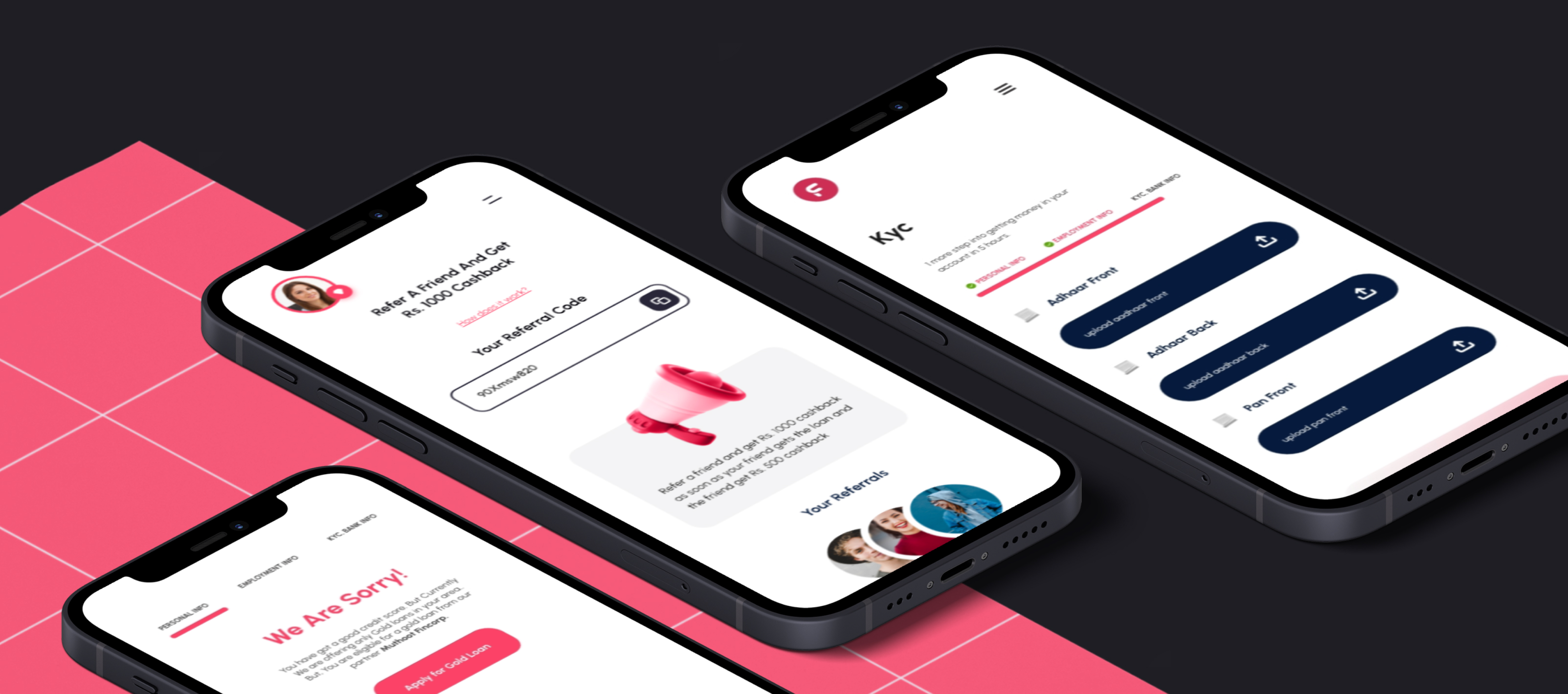
We worked with Finnable's to address core issues on the app and website to streamline the loan application process for users. We've simplified the steps to apply for a loan, introduced a user-friendly interface. We strategised to provide clear information on loan terms and a personalized dashboard where users can track their loans and payments. With these changes, we've focused on making the loan experience as straightforward and transparent as possible, ensuring Finnable's services are accessible and easy to use.
Simplify their loan application process, enhance user interface, and provide a clear, easy-to-use platform for managing personal finances
Understanding the Customer Pain Points
We initiated our process by delving into the user journey, meticulously analyzing each stage to pinpoint difficulties encountered during loan repayments. This deep dive enabled us to focus on the most critical pain points, setting a solid foundation for our ideation sessions aimed at addressing these specific issues.
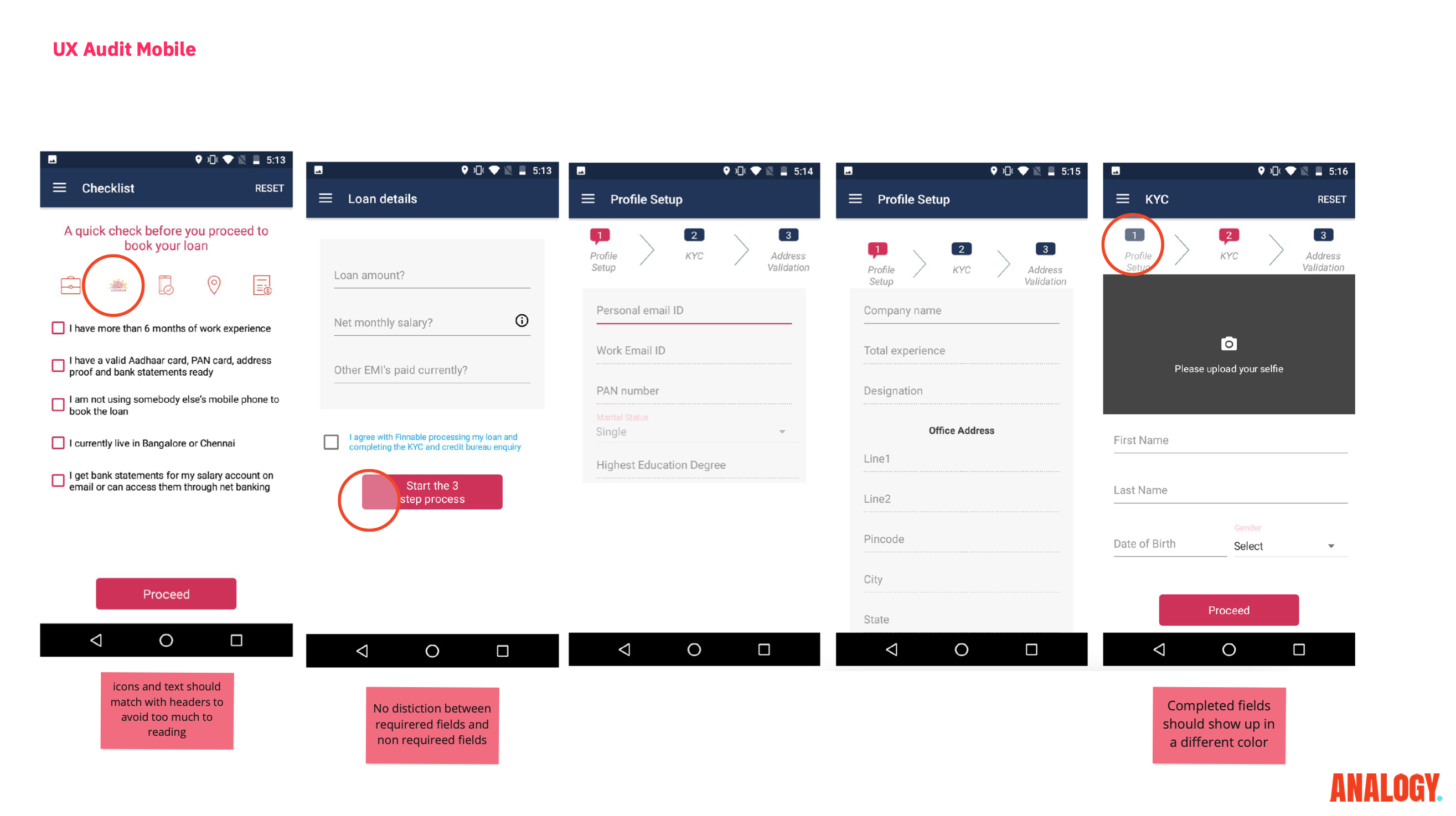
UX Audit
Our UX audit was comprehensive, examining each interaction within the loan application journey to identify flaws and friction points. By dissecting the user experience, we uncovered areas in need of refinement to enhance overall usability and satisfaction.
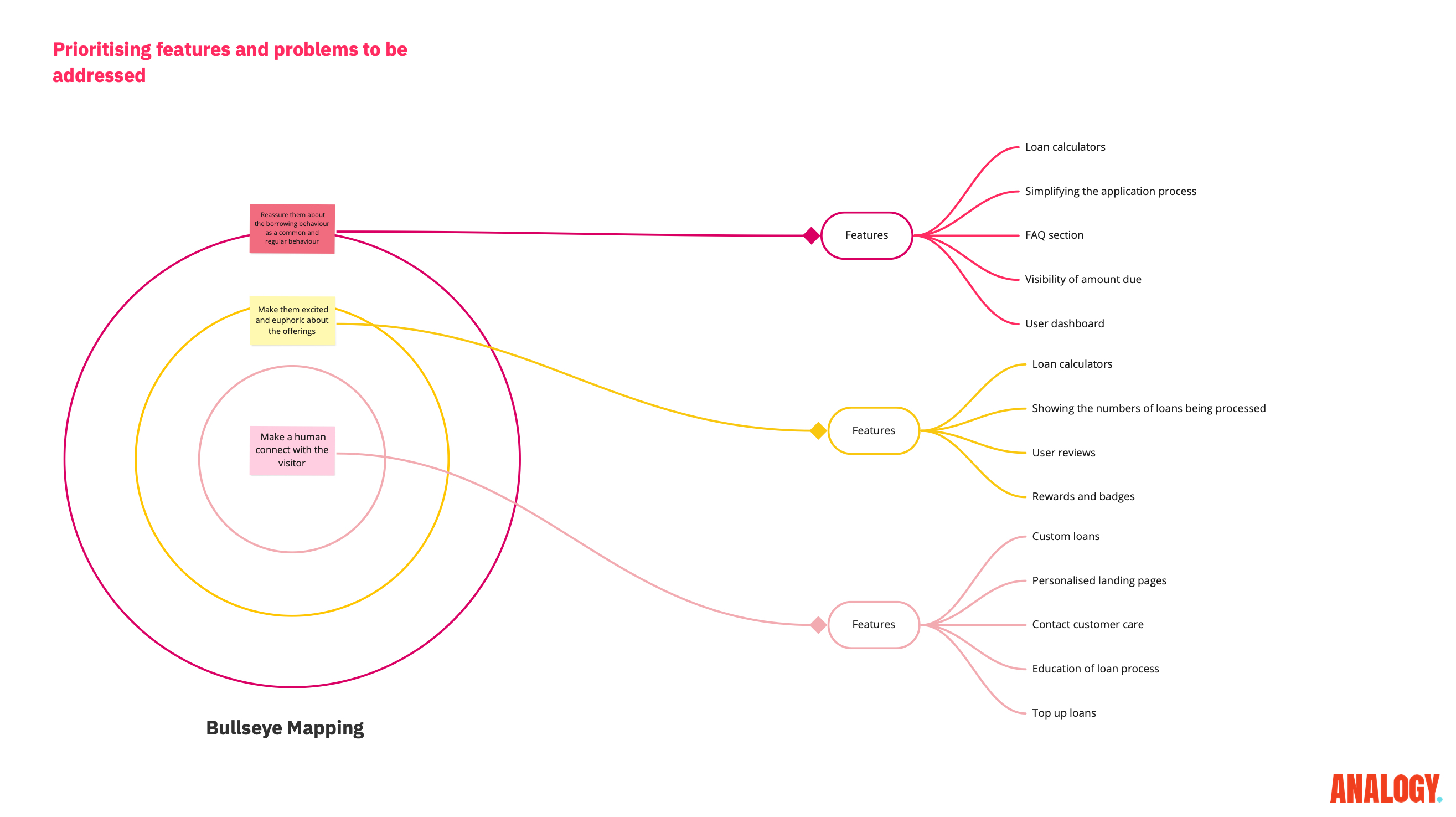
Bullseye Map
We employed the bullseye framework to categorize problems and strategize solutions. Starting with reinforcing user reassurance, we then aimed to elevate their excitement and finally foster a human connection, crafting an experience that resonates emotionally with our audience.
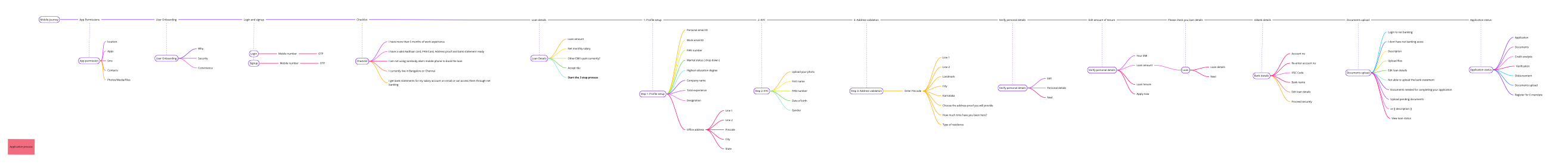
Information Tree
We applied an information tree structure to systematically organize the loan application process. This approach allowed us to distill complex information into an intuitive hierarchy, guiding users seamlessly through the core elements of the application.
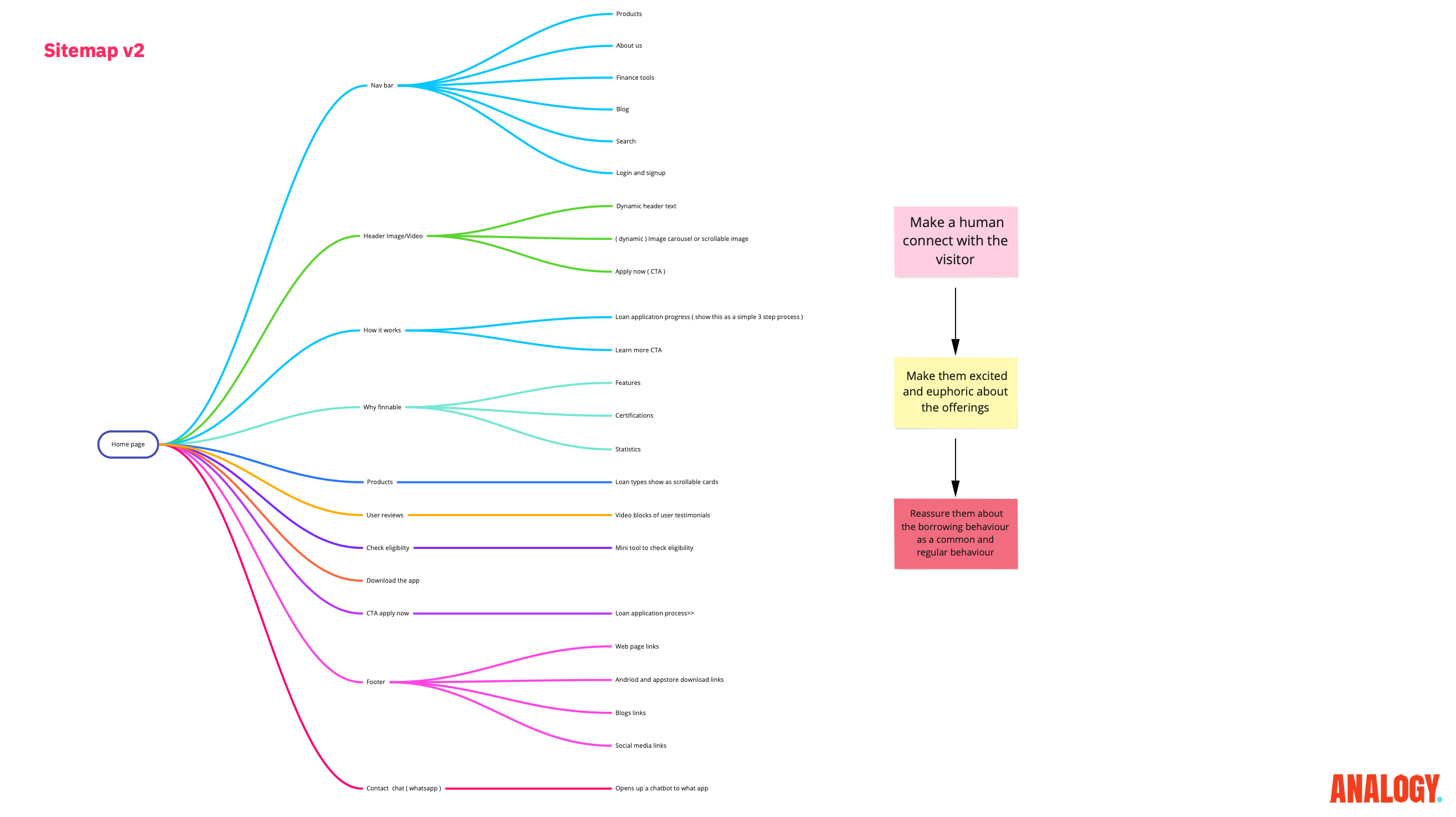
Exploring Multiple Sitemaps
We experimented with different sitemap configurations to optimize the user journey on landing pages. This involved A/B testing to determine which structures provided the most clarity and encouraged user progression.
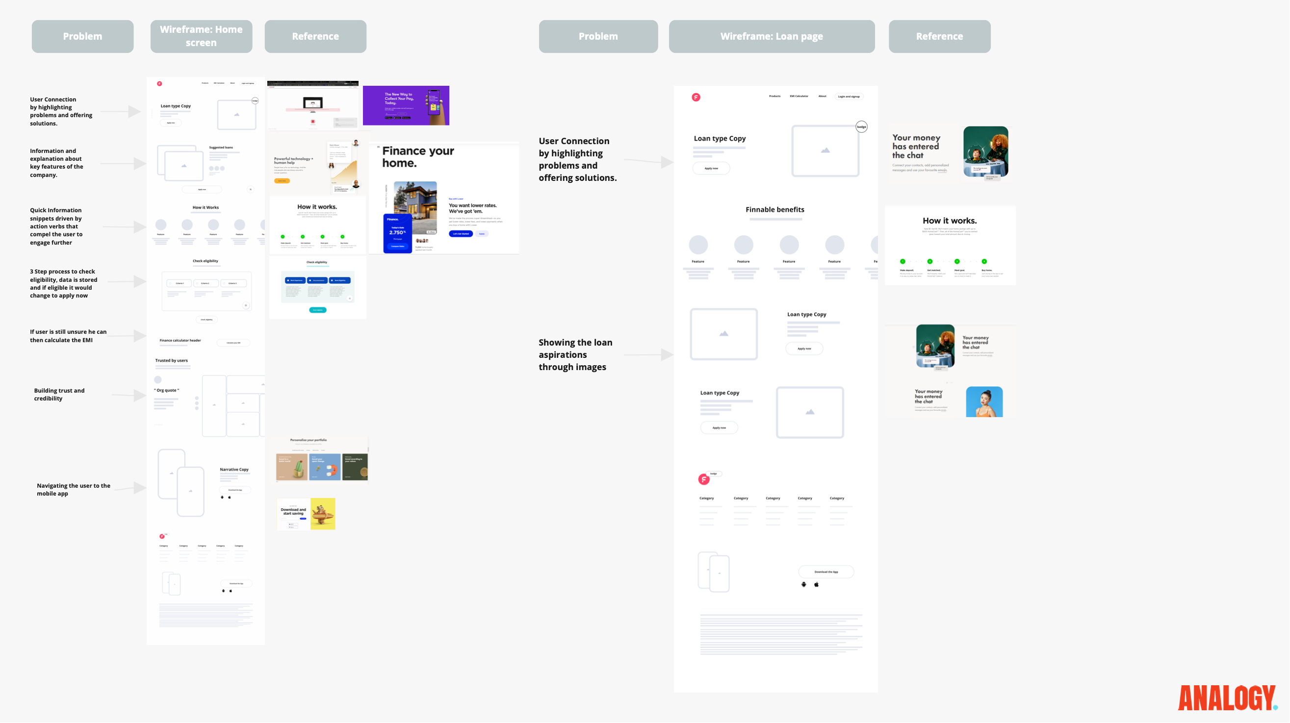
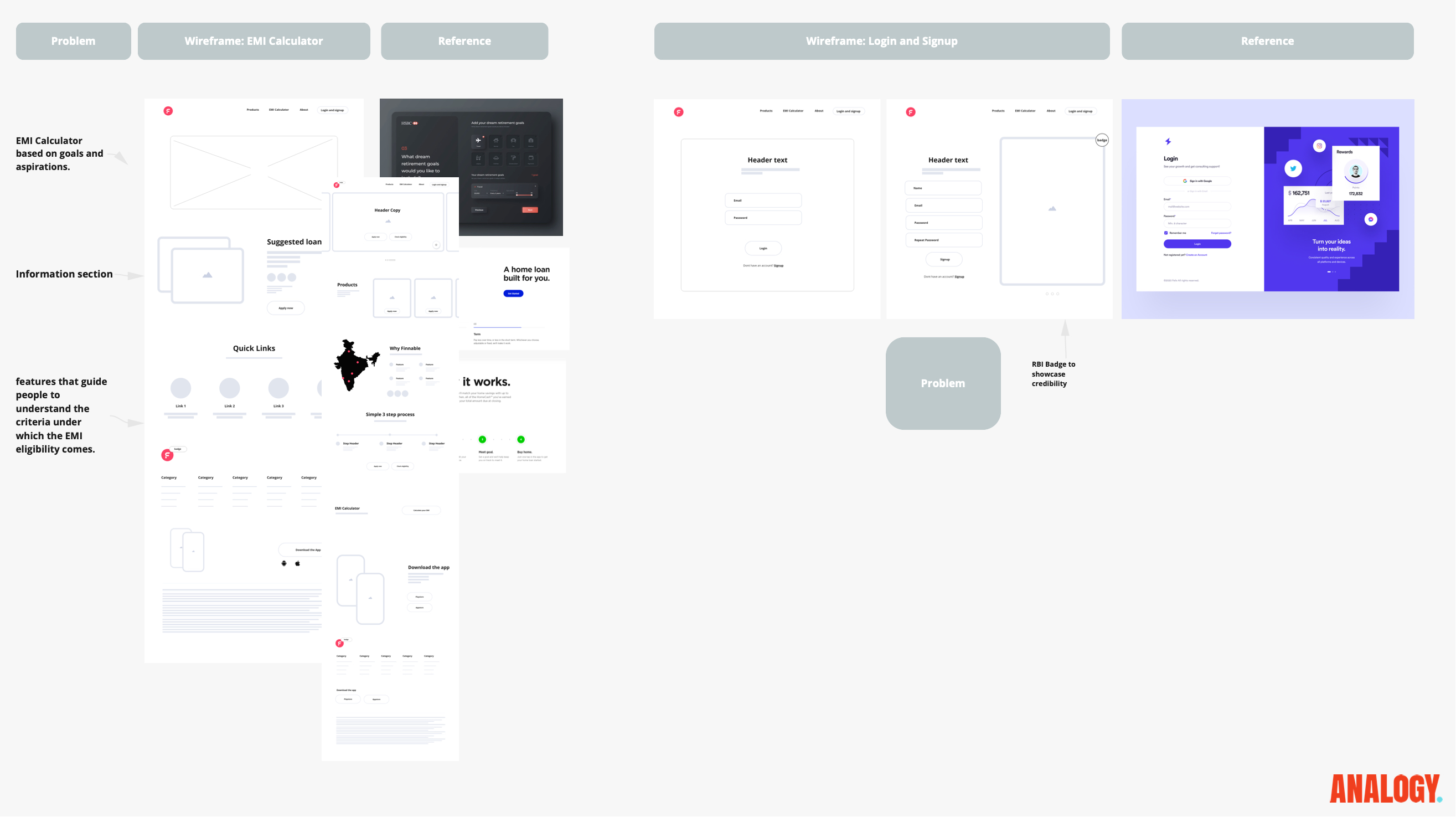
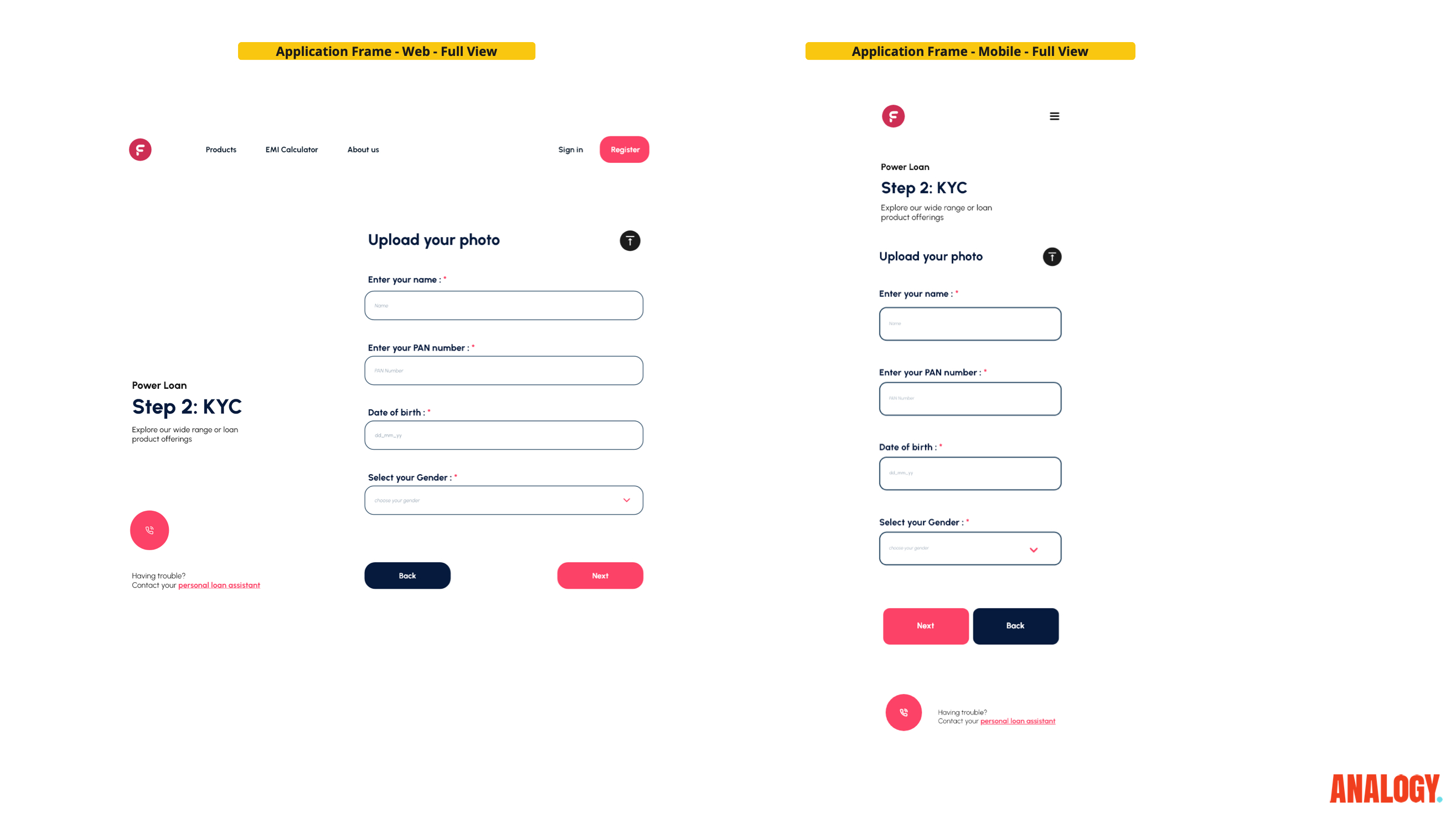
Problem-Based Wireframing
Our wireframes were constructed with purpose, each one crafted as a hypothesis to test against user needs and expectations. These early designs were continually referenced against user feedback to validate our assumptions and ensure relevance.
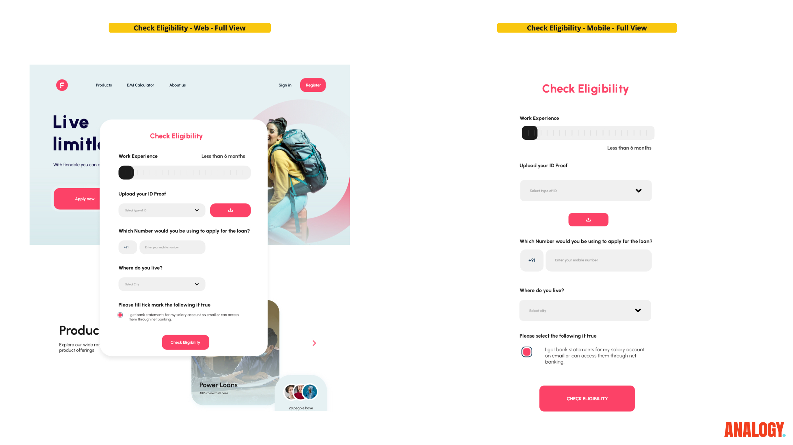
Eligibility Calculator
A strategic implementation was the development of an eligibility calculator, enabling users to quickly determine their loan qualification status. This tool streamlined the user journey, leading to a reduction in application time and an increase in quality conversions.
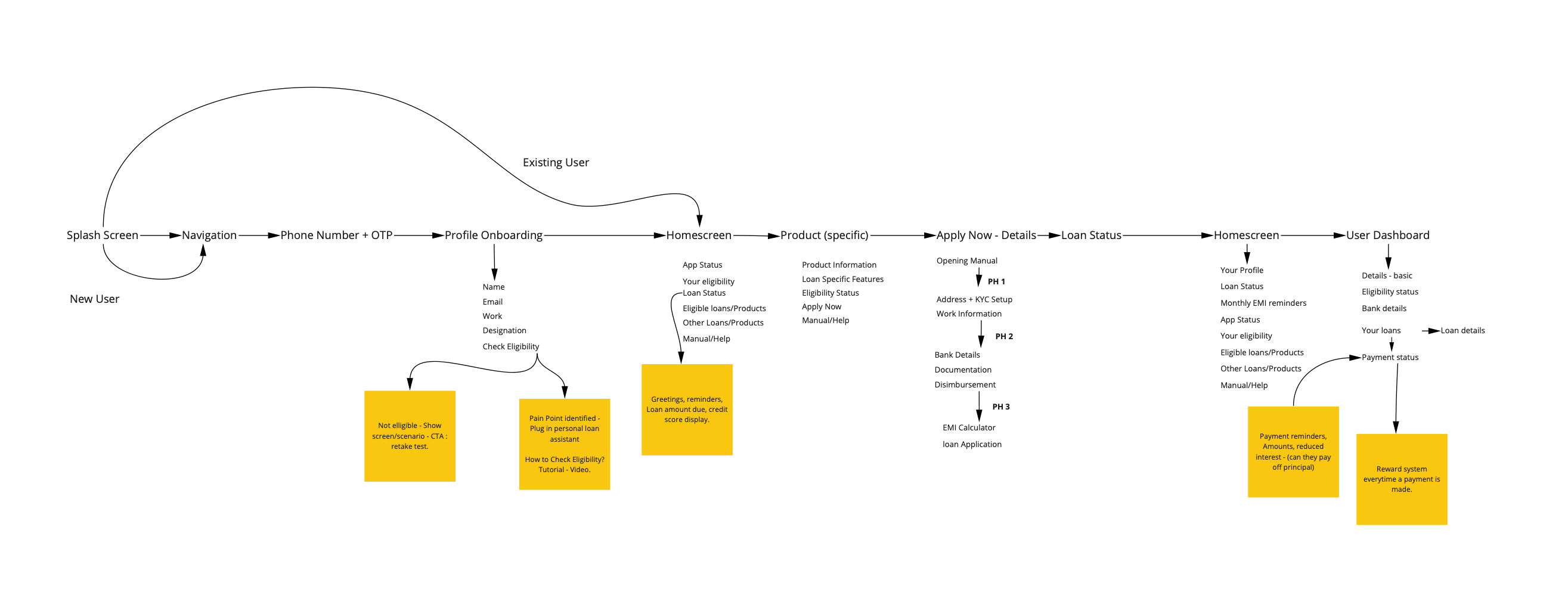
Shortening the Process
We analyzed how to utilize eligibility data and information from existing users to abbreviate the loan application process. By leveraging this data, we were able to expedite the journey while maintaining a personalized and efficient experience.
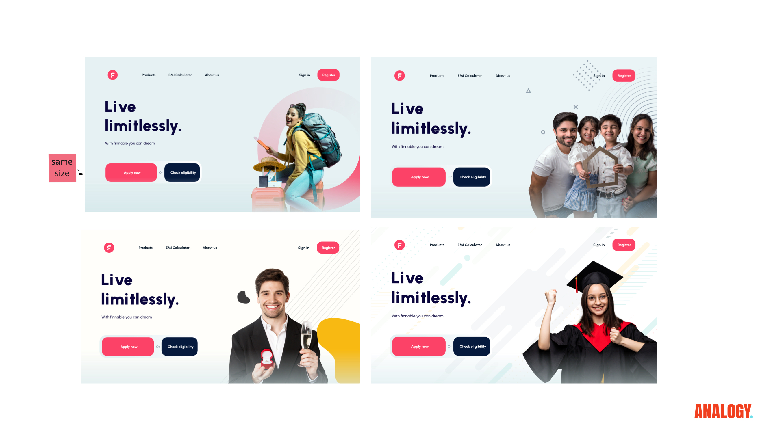
Custom Imagery
Imagery was a crucial element in connecting with our largest demographic segments and aligning with their motivations. Tailored visuals were designed to resonate with users, aiding in the creation of a relatable and engaging narrative throughout the platform.