
Nano Insights
Visualizing data for the UK's largest bank.
Team
My Role: Design Lead & Project Manager
Collaborating Team: Development team ( Pune )
Client Team (HK): Account managers and Analysts
Background
Nano insights( Client name is an alias for confidentiality) is the largest marketing and insights company, with the majority of its product, focused on customer data surveys from top companies. For this project, they approached us with a unique problem and a proposition. They had extremely detailed data and they presented all of their findings which are very detailed in PowerPoint which made things really cumbersome, plus the fact that it was not on the cloud and the data visualizations were not interactive seriously inhibited the decision making of the top execs for their client, one of the largest banks in the world. The data gathered over 10M+ data points under the various sectors in more than 30 odd countries that determine the future trends and provide valuable insight to its customers who use these to make important business decisions.
Visualizing data for the UK's largest bank.

The product initially took the form of extensive presentations and Excel spreadsheets, serving as repositories for market trend data and figures across different segments. The client's objective was to condense this wealth of information into a user-friendly dashboard with enhanced capabilities, including data filters and data point relationships. To achieve this, we needed to gain a deep understanding of how customers would interact with the dashboard, identify the specific calculations and filters necessary for deriving data insights, and create visual representations for various data types and models.
Navigating Clarity
One of the significant challenges we encountered revolved around crafting an intuitive user experience. Initially, the product existed in the form of PowerPoint and Excel sheets, which posed navigation difficulties. However, since customers were accustomed to this format, it became a pivotal aspect to address when designing the dashboard. We organized the dashboard into four key sections, with three mirroring the elements from their prior product.
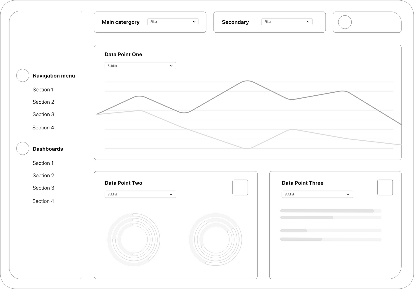
The Navigation block on the left would act as the central hub where users could navigate through the different markets and each dashboard would contain the market data with a top to bottom filter hierarchy. Colour and Opacity played an important role to quickly find the relations between markets and this could be easily stacked on top of each other add complexity while still keeping the overall dashboard clean and easy to understand. Additionally, each graph when clicked would show an isolated relation to making it easier to use and avoiding the use of multiple filters and rules to arrive at a certain insight point.
Data Visualisation Types
Data visualization played a pivotal role in ensuring that the user experience we, as the client and Analogy, aimed for was accurately conveyed. Simultaneously, we were mindful of the need to develop, rigorously test, and ensure a bug-free overall application. We also considered user behavior, striving to provide a seamless transition without introducing radical changes that could complicate their tasks. We aimed to strike the right balance of innovation in terms of UX, navigation, and UI. To achieve this, we embarked on the journey of understanding the fundamental principles of graph types suitable for our dashboard.
Numerous prototypes and visual options were crafted, all data altered to maintain client confidentiality. Our primary objective was to present bar graphs and pie charts in a manner that effectively communicated relevant and meaningful data. Below, we explain the rationale behind our choices.
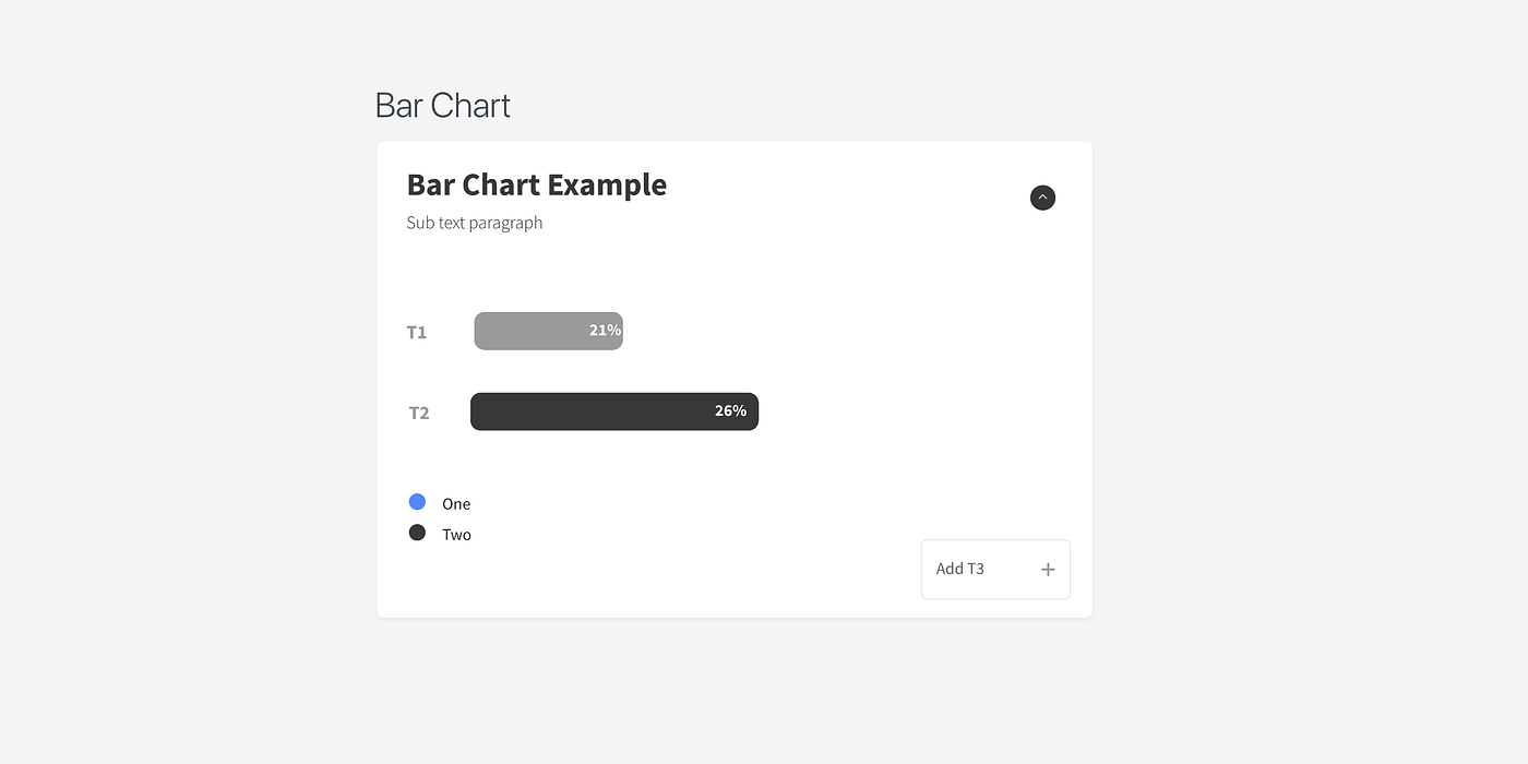
This visualization method was employed to depict relationships between a limited number of data points and markets. The bar chart is known for its simplicity and is most effective in illustrating straightforward connections and associations within data.
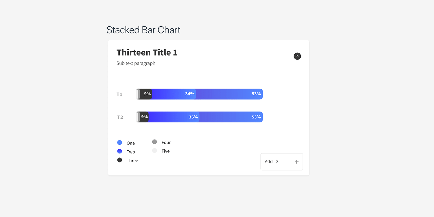
The stacked bar chart introduces an additional layer of complexity to the standard bar chart. It becomes especially useful when you need to illustrate multiple attributes within a single market and make comparisons with another market. By using a stacked bar graph, you can swiftly grasp the distinctions between the two market segments and also gain insights into the composition of each market response.
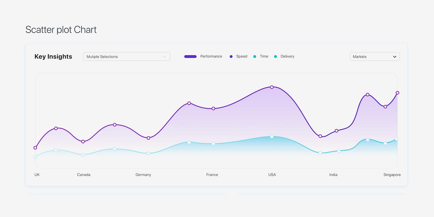
A scatter plot graph offers an overarching perspective on market trends across multiple markets. This visualization method proves invaluable for comprehending future trends, given its capacity to depict data on a broader scale. However, it has limitations in delving into finer details that underlie these relationships. When complemented with a dual-axis chart, this type of graph gains remarkable power, revealing global trends and enhancing our understanding of the connections between two markets.
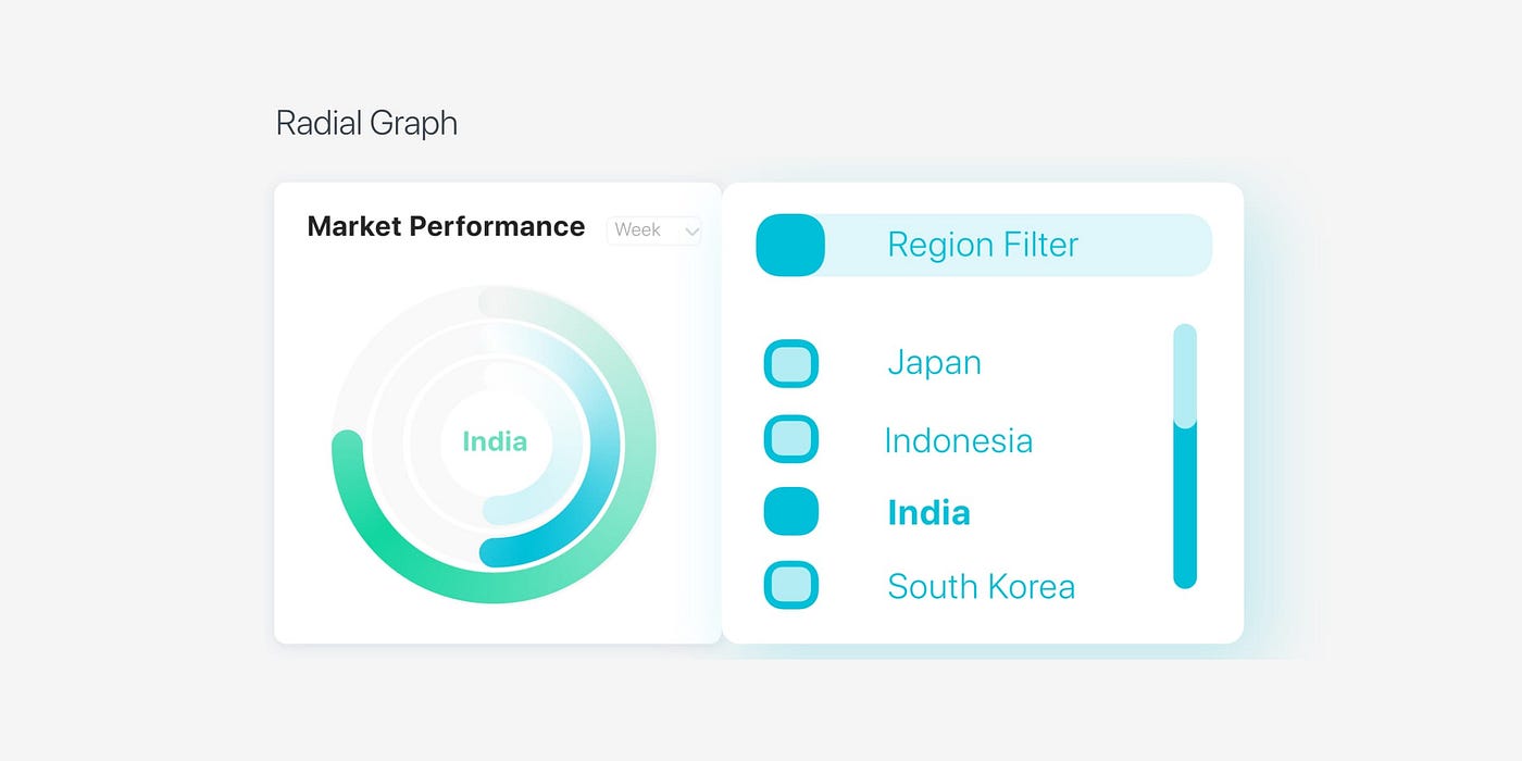
Radial charts are most suited for illustrating data points that sum up to 100 or a predetermined fixed number, commonly used for comparing two markets. They effectively display the percentage breakdown of each data point. Moreover, this data visualization method can be extended by stacking concentric circles to highlight relationships between two to three additional markets.
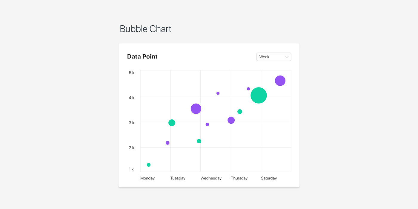
A bubble chart effectively visualizes data relationships across three distinct axes, namely X, Y, and Z. These axes can be leveraged to represent diverse data forms and can be superimposed onto another bubble chart to offer valuable insights into the relationships between two market segments.

Every data visualization style and chart needed to be meticulously planned in order to facilitate their translation into a functional model within Power BI. The team worked in close collaboration with the client's data processing department and the Power BI developer to gain a deeper understanding of the intricacies, calculations, and diverse data types required to arrive at the final data points.
