
Panasonic Miraie
Designed for local, with a global standard.
Team
My Role: Design Lead & Project Manager
Managing Team: UI Designer/Illustrator, Researcher, UX Designer.
Collaborating Team: External Research Agency, Tata Elxsi, Panasonic IIC
Background
We developed an ecosystem that encourages passive users to become active and empowered through a seamless, gradual interface. Our design challenge was to create a connected experience that starts from the basics and becomes deeply intuitive while keeping the visual elements engaging yet light enough to run on lower-end phones at scale.
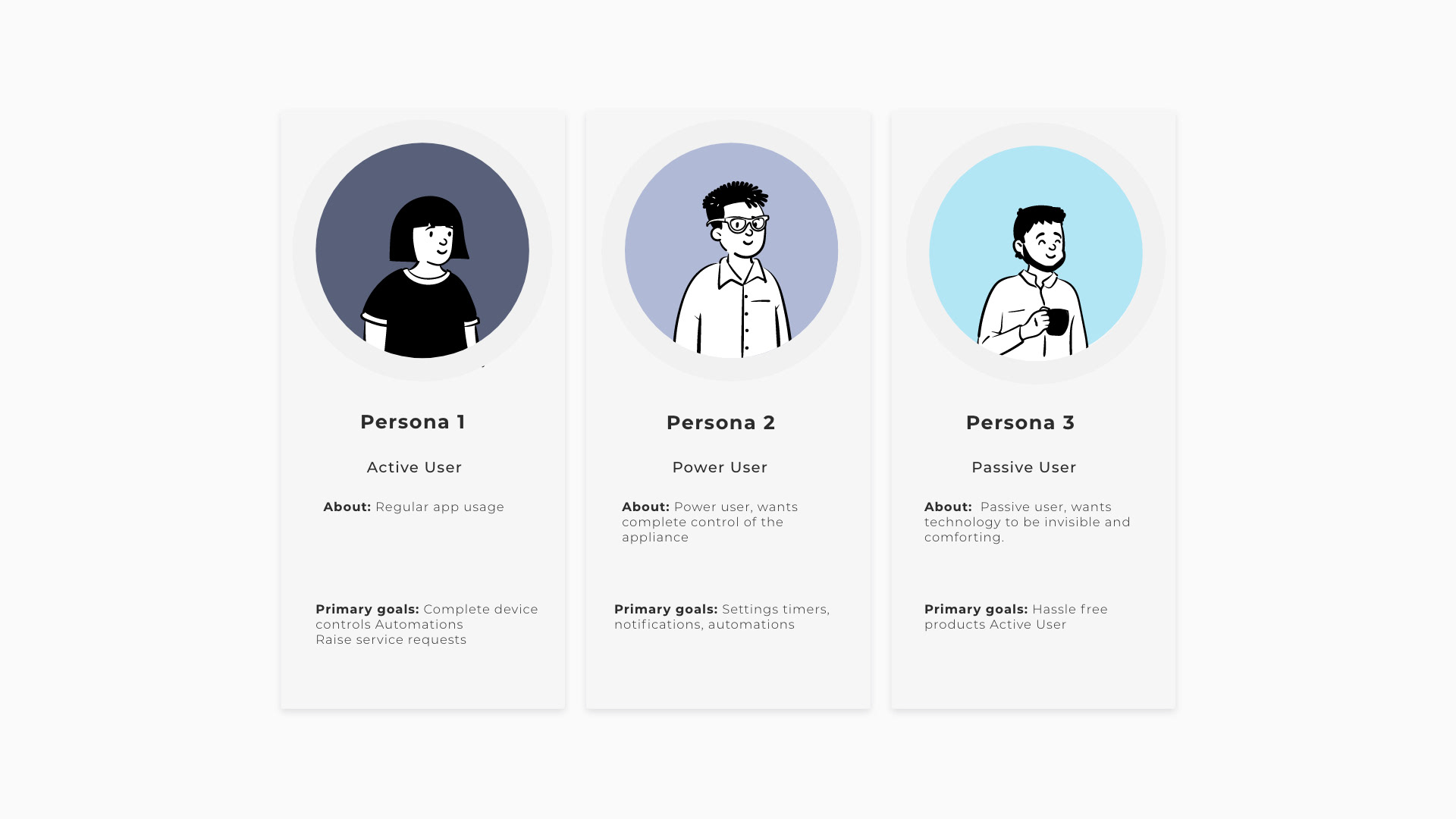
Our approach was to introduce users to basic functionalities and gradually lead them to more advanced features like automation, sleep cycle, troubleshooting, and data analytics. By doing so, we aimed to raise awareness and promote wider adoption. We mapped the first-time and repeat user journeys and created distinct user personas to separate frequently used actions
We designed a user-friendly digital experience for Asian consumers, blending familiar physical elements to ease the transition to new tech, thus minimising the learning curve.
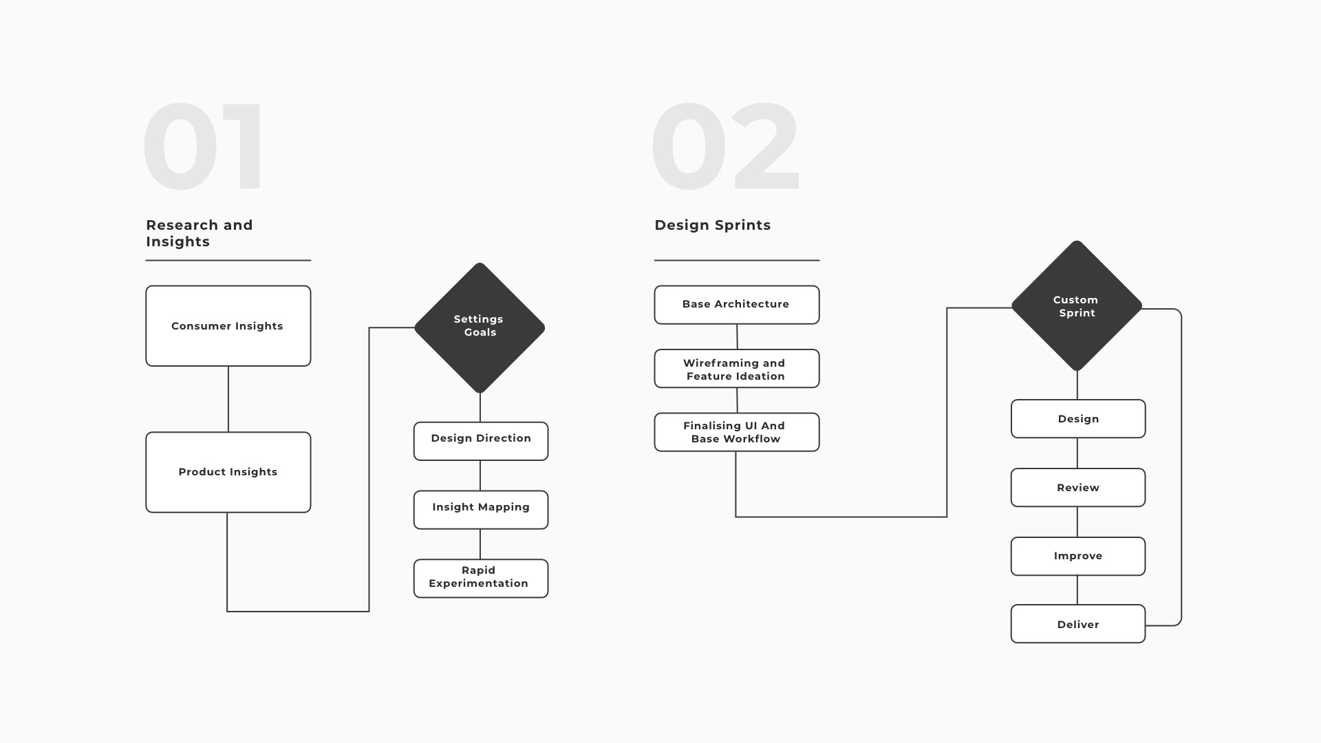
Customizing The Design Process To Achieve Success
We made our design plan fit well with how Panasonic's team works. We mixed a step-by-step approach for studying with a flexible way of doing things. This mixed way of working made a smart home design that's easy to use, fun, and can grow. It does what Indian families and Panasonic wanted.
Through interviews and home visits, we understood Asian consumer device usage and behaviours.
Our research categorized users into active, passive, and power users. We designed basic functions for the first two groups, while advanced features catered to power users. This created an intuitive, adaptable experience for all, meeting the needs of Indian households across various devices.
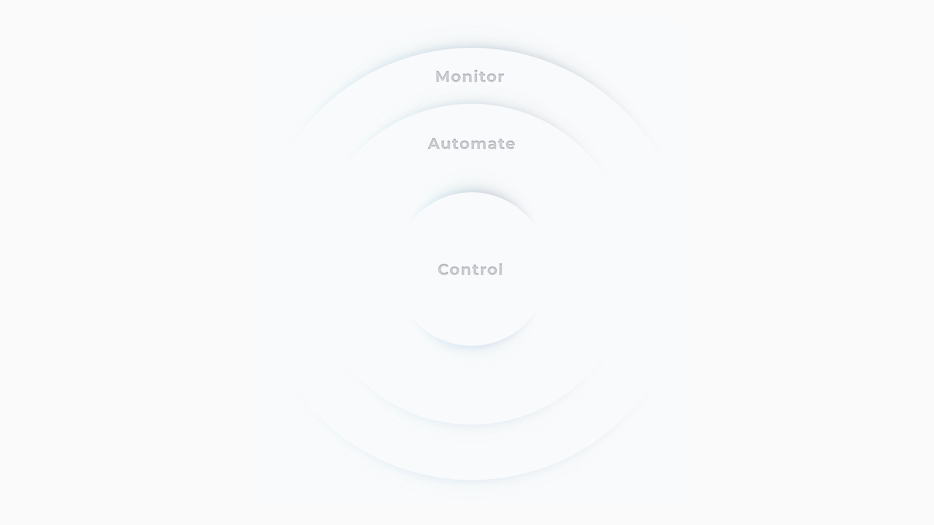
Interaction building blocks
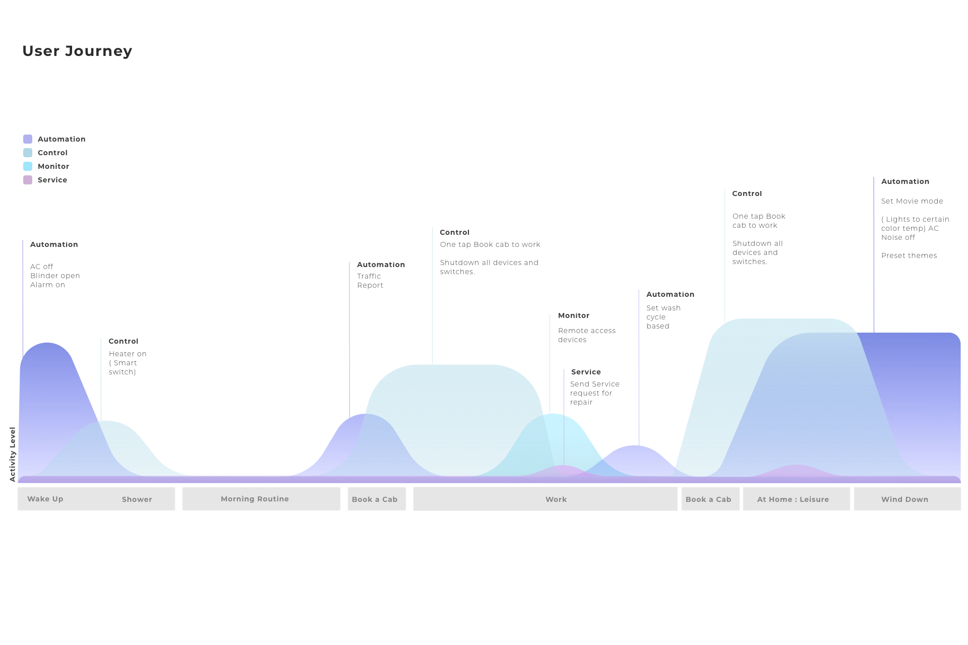
We took a deeper understanding of the user journeys, looking at different levels of how the user would use the application and levels of control, stacking them up into a platform that takes a full day's worth of considerations.
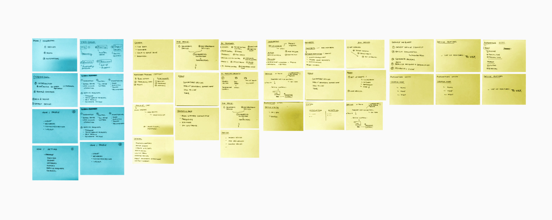
In-depth sessions with leadership and key stakeholders to understand and address usability issues. This was achieved by translating functions into user flows, developing wireframes, and facilitating workshops.
Market data to base interactions
We worked closely with the marketing team to understand how they want to develop the overall experience of the app.
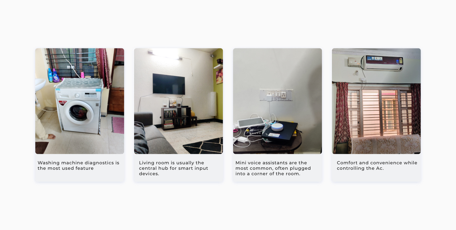
Field Research
We spend time understanding the user's environment, understanding how they would use smart devices on a day-to-day basis, and what they would want from their devices.
Experiment Led Validation.
Testing various concepts to recreate physical interactions familiar to Indian consumers in an engaging, intuitive interface. This exploration guided us towards a design that fits our connected experience philosophy.
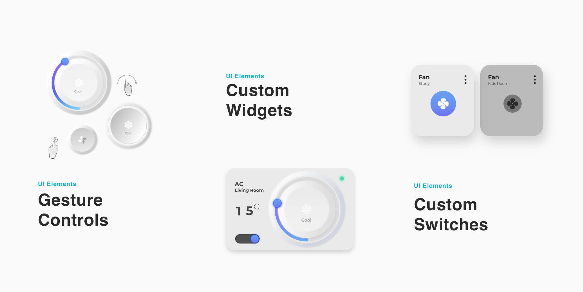
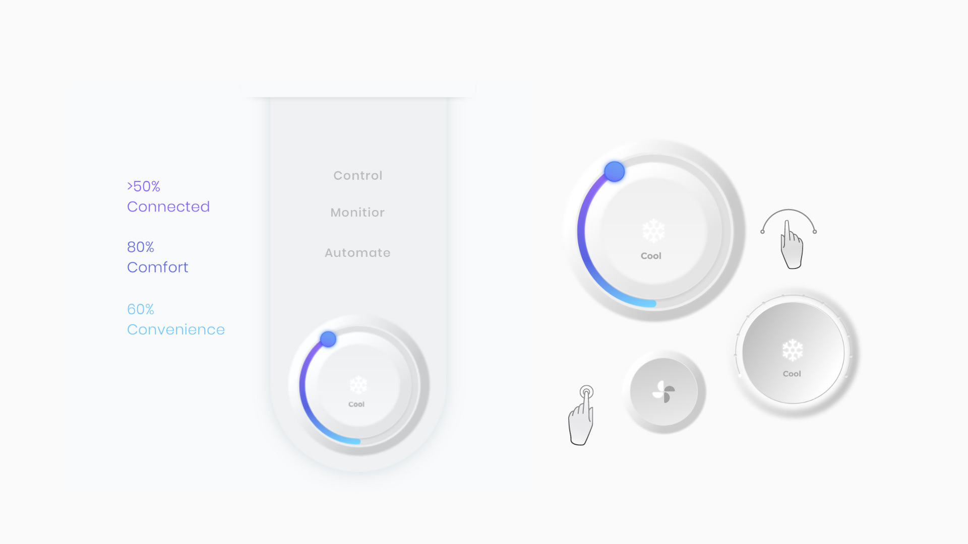
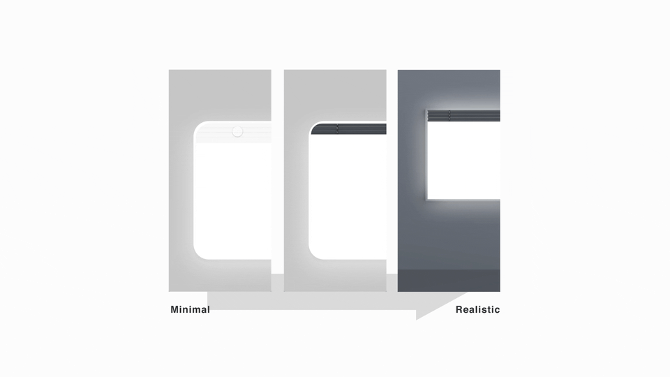
Bringing In Familiar Objects
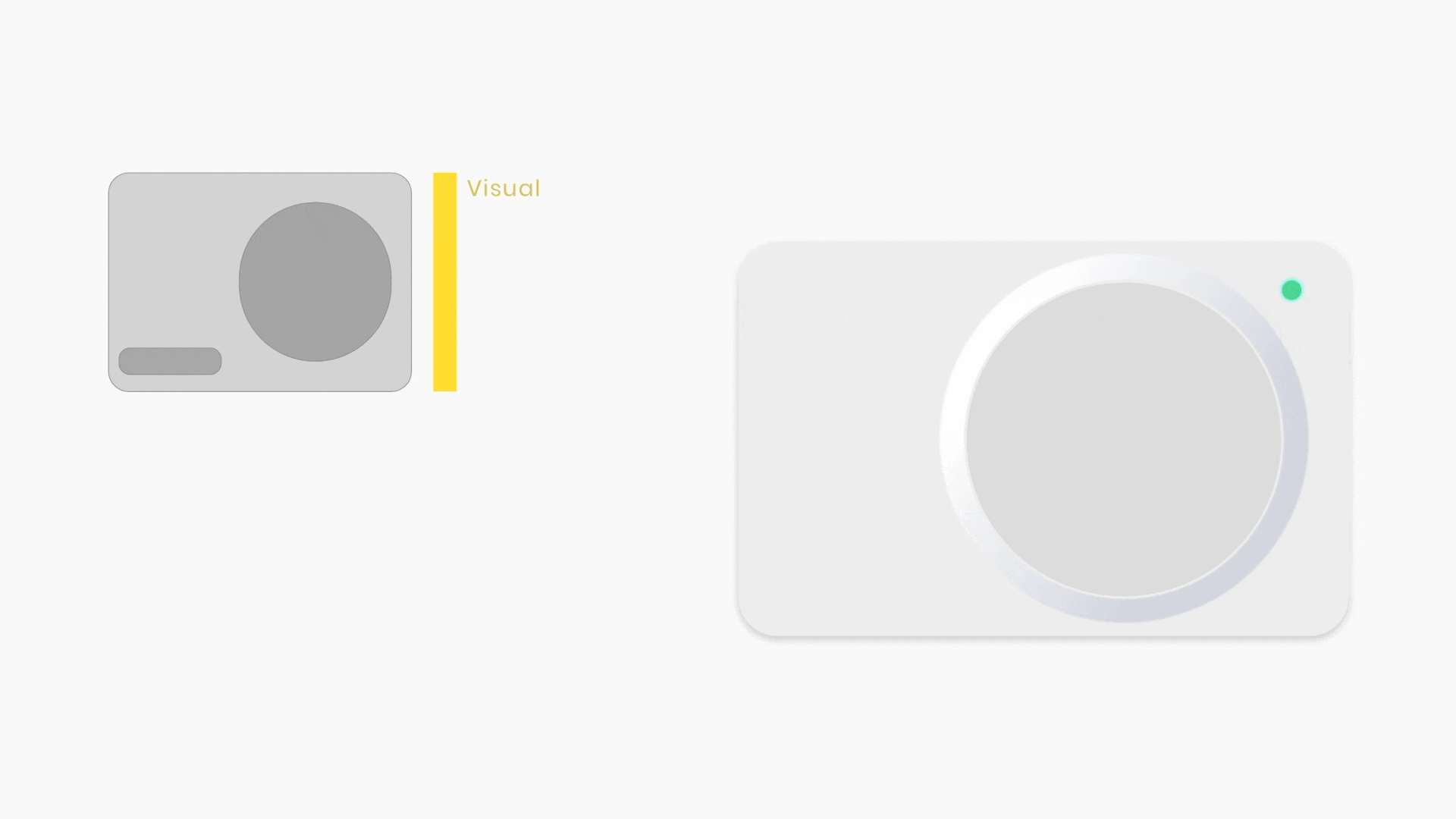
We used a subtle neo-morphic UI to replicate familiar objects like switchboards and thermostats, making the app easier to navigate and more engaging, while also adaptable.
Widgets
The home dashboard has layered interactions like swiping and tapping, with visual feedback and uncluttered secondary options. With clear focus on the 3 user groups.
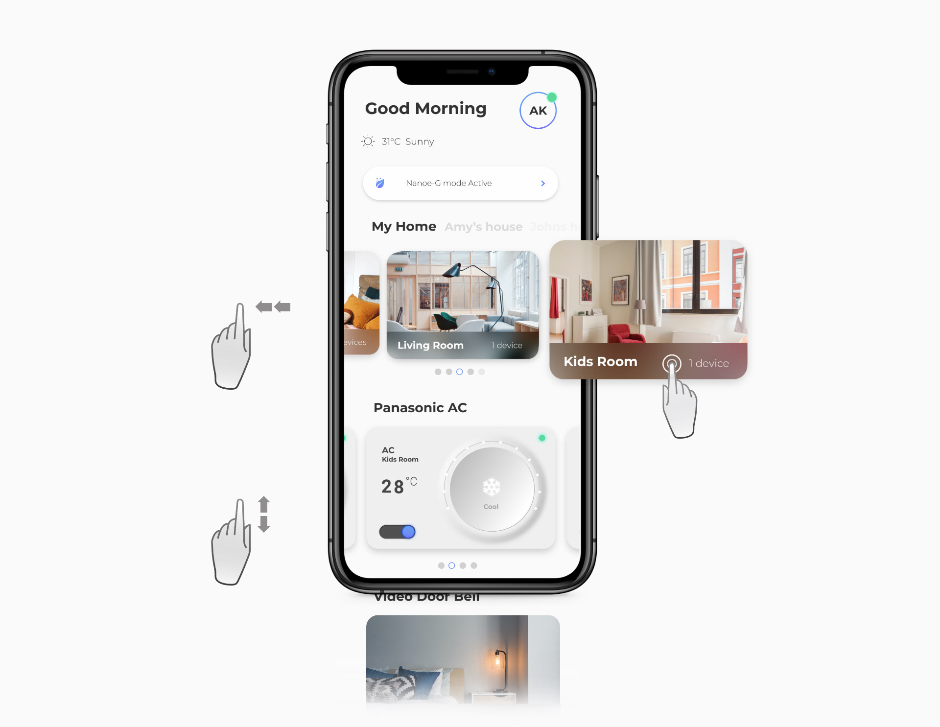
Multi-gesture Navigation
multi-gesture navigation for room and smart item access, providing intuitive control with visual feedback. This user-centric design enhances engagement and enjoyment.
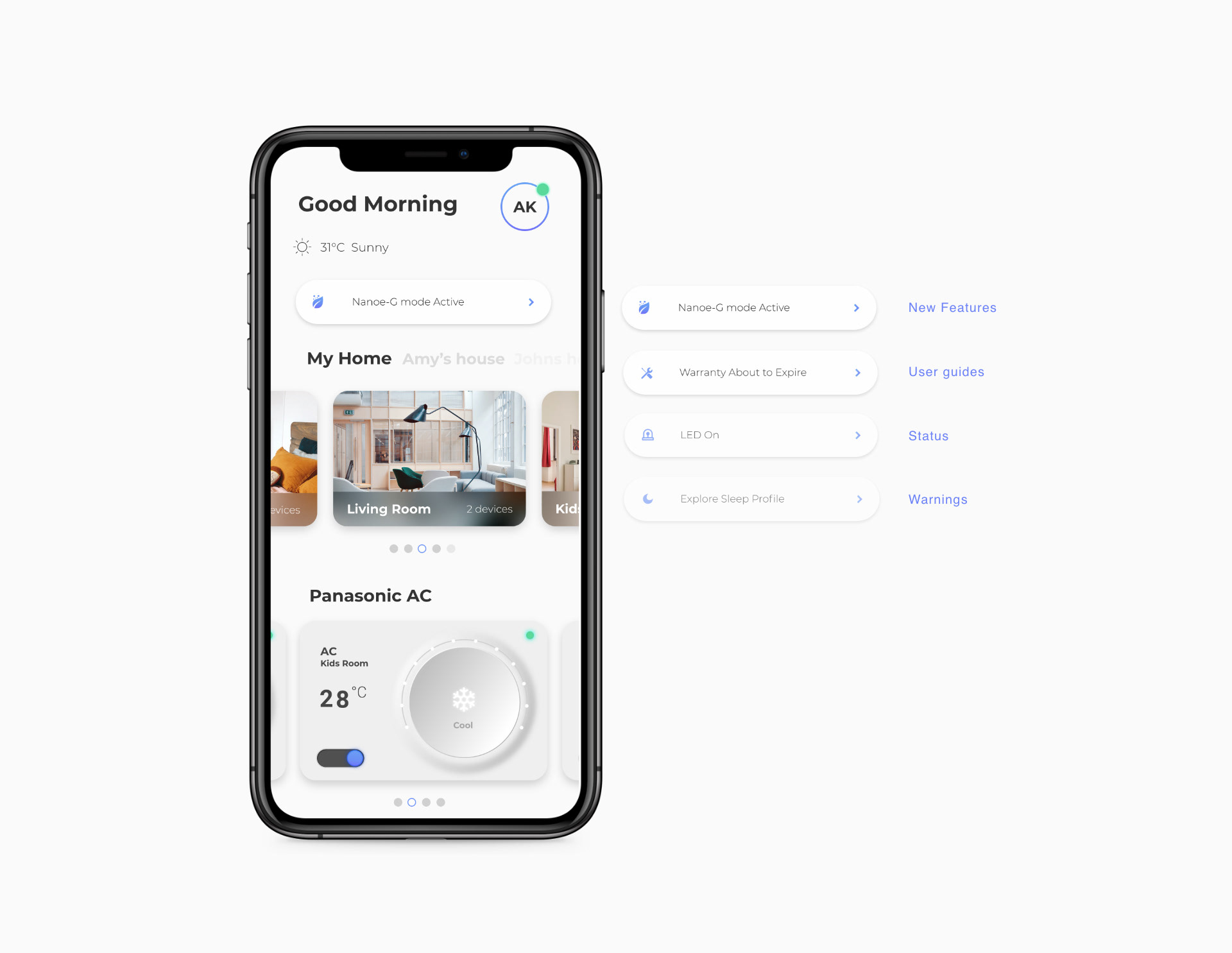
Nudges > Notifications
Instant access to vital functions and smart notifications based on device status, enhancing user engagement and experience.
