Case study / Finnable
Finnable.
Reframed a loan application journey around trust, clarity, and fewer moments of hesitation.
Duration
Mar-Jun, 2023
Client
Finnable
Category
Product Design
Year
2023

Challenge
Loan applicants needed faster answers, clearer terms, and more reassurance at the moments where financial decisions felt risky.
Approach
Audited the application journey, mapped repayment friction, explored alternate sitemaps, and used problem-based wireframes to test clearer paths.
Outcome
Created a redesigned flow direction with sharper hierarchy, an eligibility calculator concept, and clearer loan-tracking moments for product and marketing teams to execute.
Scope
Led the UX audit, journey mapping, information architecture, wireframing, and cross-functional design reviews with product, marketing, and leadership.
Overview
Reducing hesitation in a high-trust financial journey
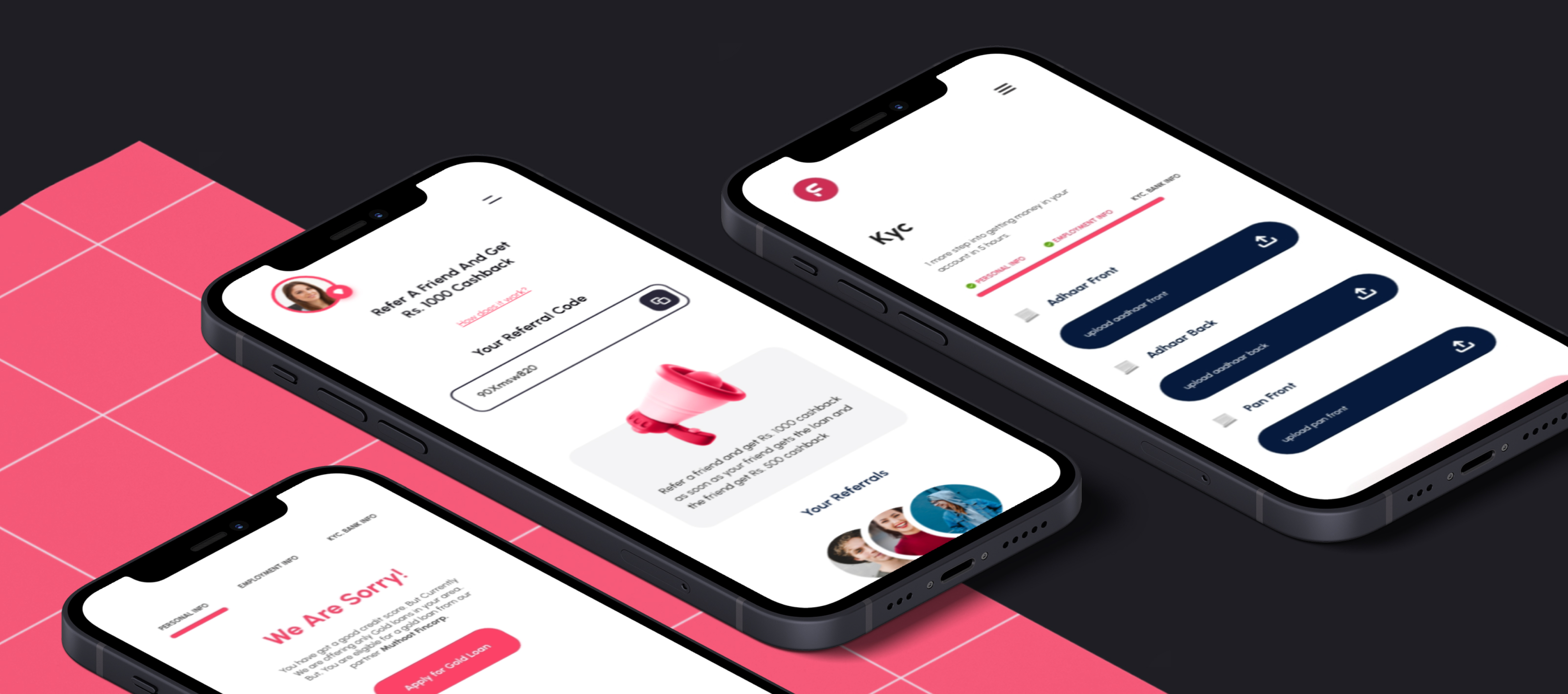
Finnable's app and website needed to make loan discovery, eligibility, application, and repayment feel easier to understand. I led a structured audit and redesign direction that turned scattered pain points into a clearer journey: reassure users early, shorten the path where existing data can help, and make loan terms and repayment status easier to track.
Role
Lead Designer
Services
UX Audit · Information Architecture · Interaction Design
Team
UX/UI Designer · Marketing · PM · Leadership
Full flow
App, website, application, repayment, and tracking moments reviewed as one journey.
Audit scope
3
Reassurance, excitement, and human connection organized redesign priorities.
Decision lenses
Shorter
Eligibility and existing-data concepts reduced unnecessary steps before deeper application effort.
Application path


Context
Financial products fail when clarity arrives late
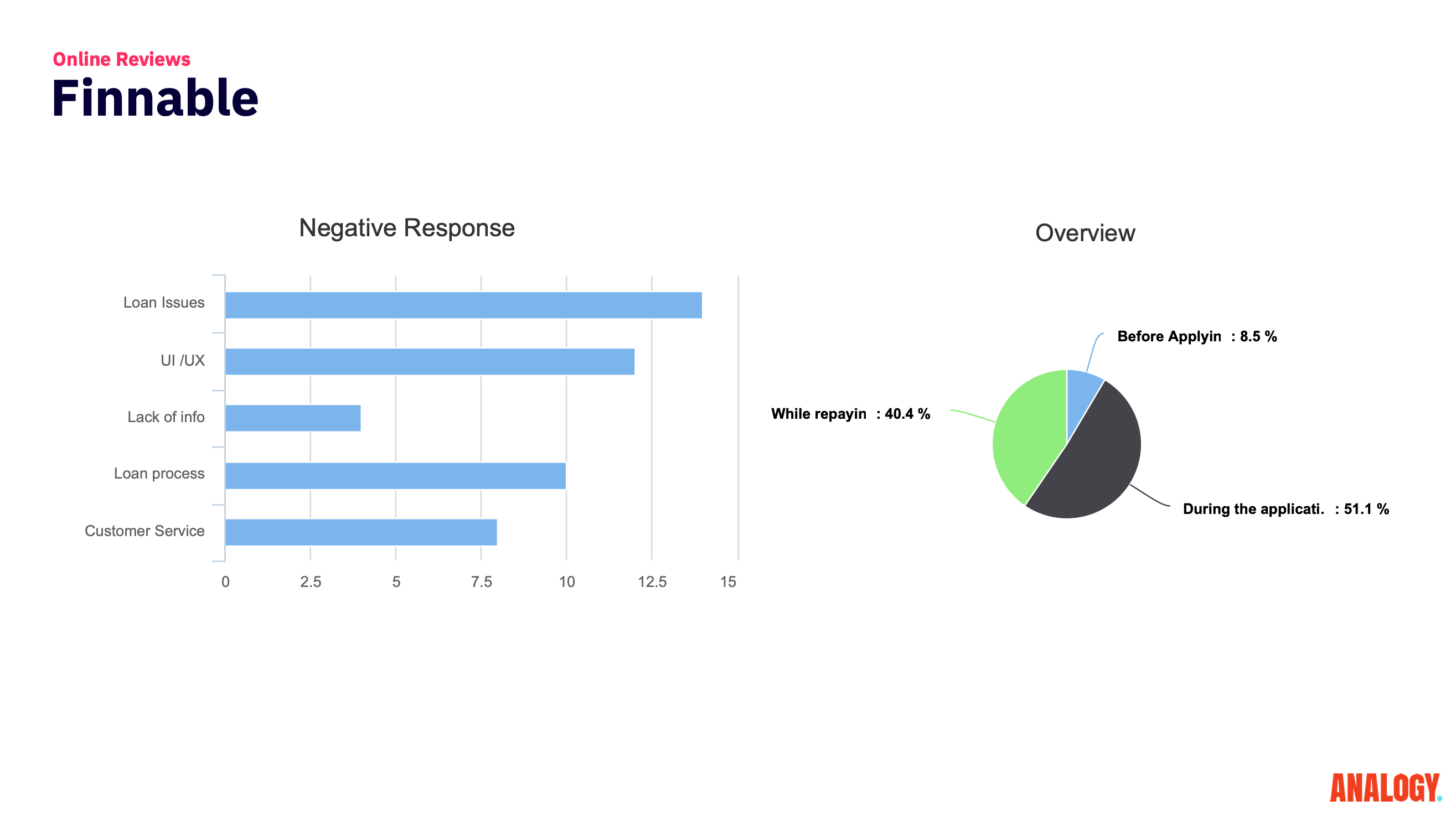
Finnable needed the app and website to support people applying for loans, understanding terms, and tracking payments. The existing journey had moments where users could lose confidence before reaching the next step.
The redesign direction focused on making the loan experience more straightforward and transparent: simplify application steps, present terms clearly, and give customers a more useful way to track loans and payments.
Journey mapping
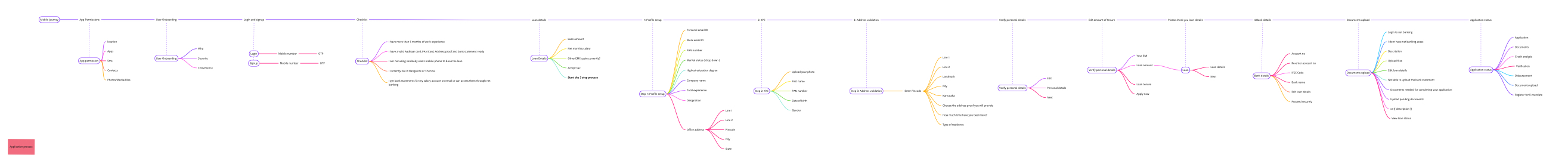
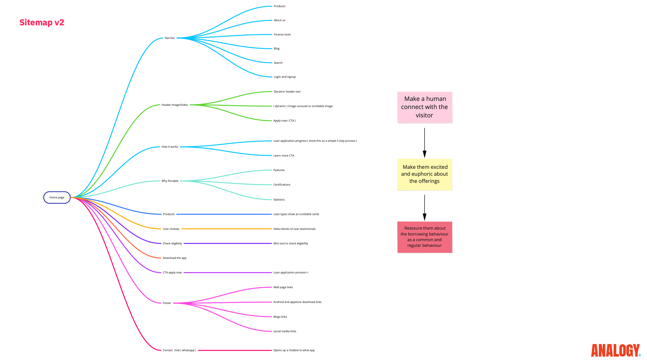
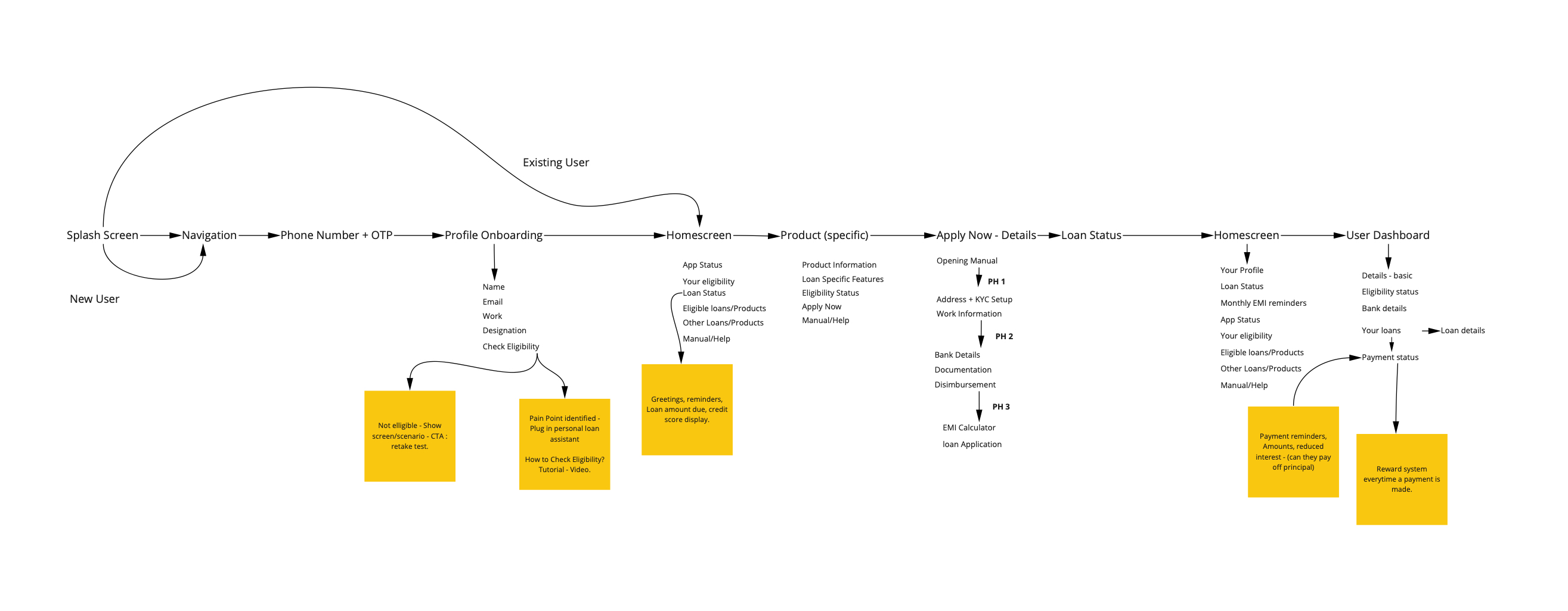
Seeing the application as one connected system
The work started by mapping the customer journey across discovery, application, approval, repayment, and account management. This helped the team evaluate the experience as a connected financial service rather than a set of separate screens.

Customer pain points
Pinpointing repayment and trust friction

We analyzed each stage of the journey to identify where users might hesitate: unclear eligibility, uncertainty about terms, repeated information entry, repayment visibility, and the emotional weight of making a financial decision.
Those pain points became the basis for ideation. Instead of redesigning screens broadly, we focused on the moments where better structure could remove doubt.
UX audit
Diagnosing friction across the flow
The UX audit examined the application journey interaction by interaction. The most important gaps were not cosmetic; they were moments where trust, visibility, and next-step clarity needed reinforcement.
This gave product, marketing, and leadership a shared language for what had to change before visual design refinement.

Prioritization
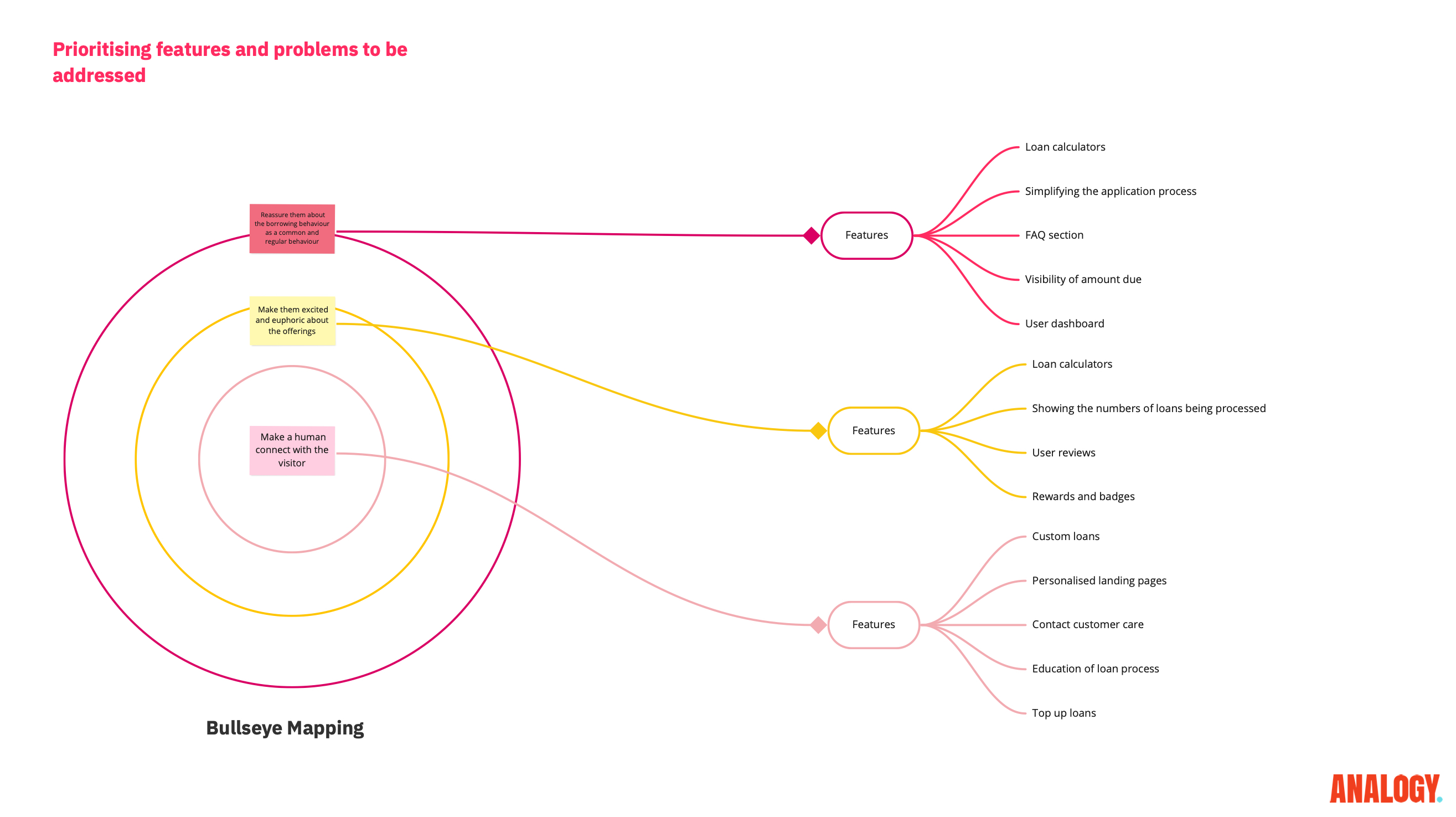
Reassurance before excitement
The bullseye map grouped opportunities by emotional need: reassurance first, then excitement, then human connection. This helped the team avoid treating every issue as equally urgent.
For a loan product, conversion is not only about speed. Users need to feel that the next step is safe, legible, and worth taking.

Information tree
Structuring complexity before screen design

The information tree distilled complex loan details into a clearer hierarchy. It clarified what users needed before applying, during eligibility, after approval, and while tracking repayment.
That structure helped the team make the experience easier to scan without oversimplifying important financial information.
Sitemaps
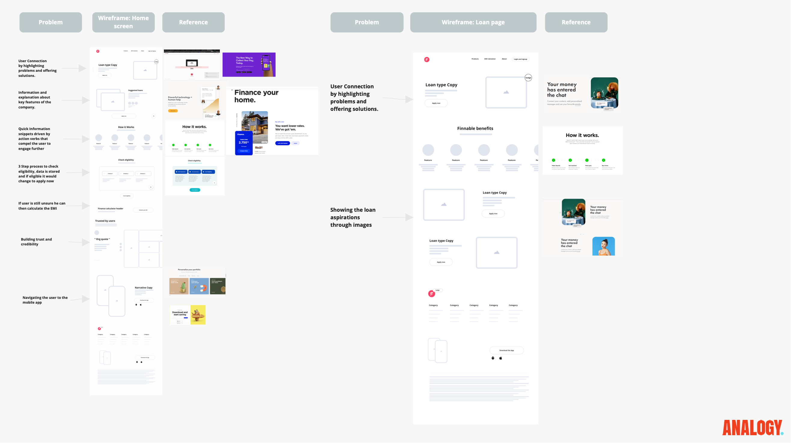
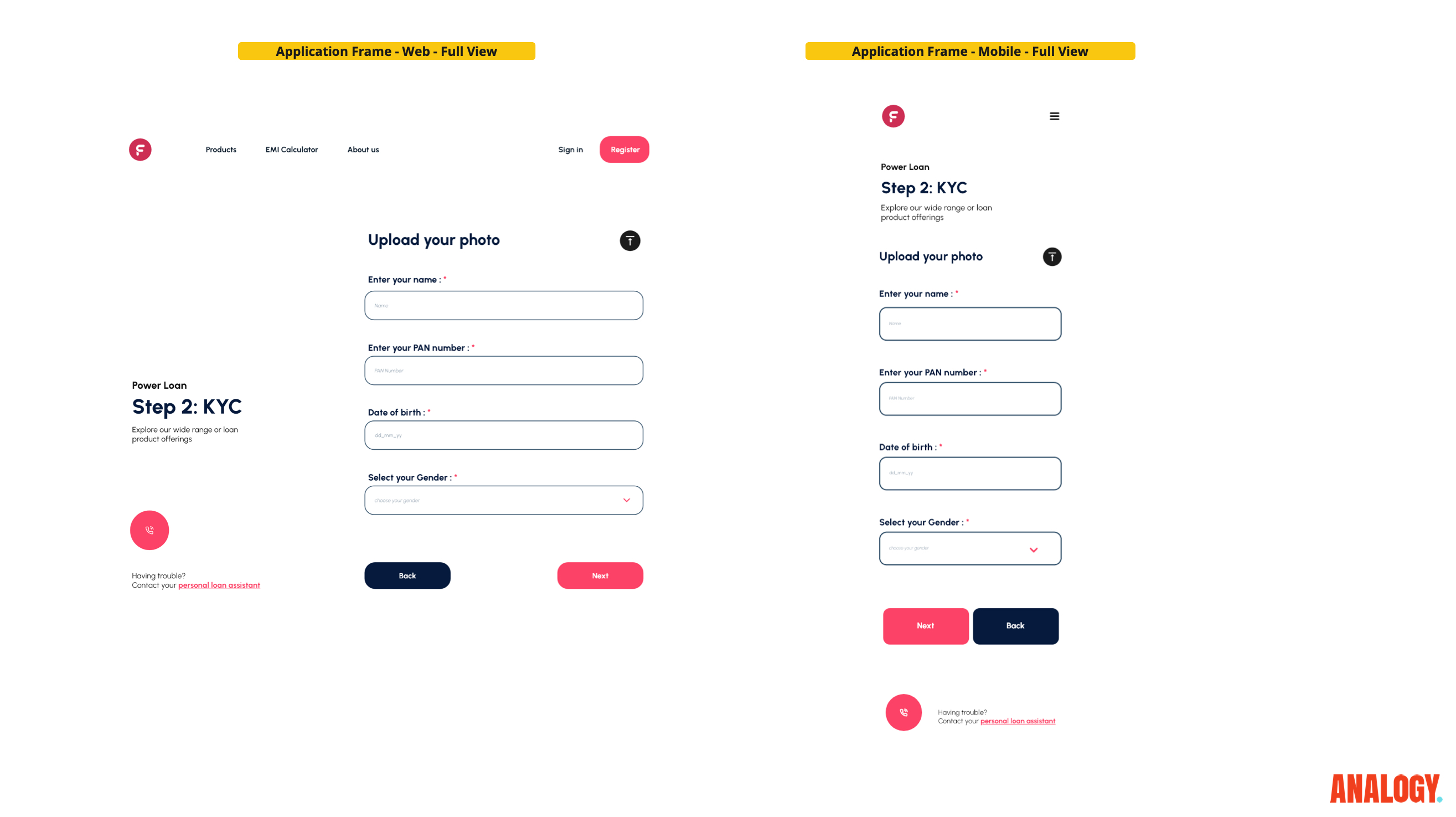
Testing alternate paths into the product
We compared multiple sitemap configurations to improve clarity and conversion quality. The work gave marketing and product a clearer shared structure for how users should move from interest to eligibility and application.
The important decision was to reduce the distance between customer intent and the information needed to act with confidence.

Wireframing
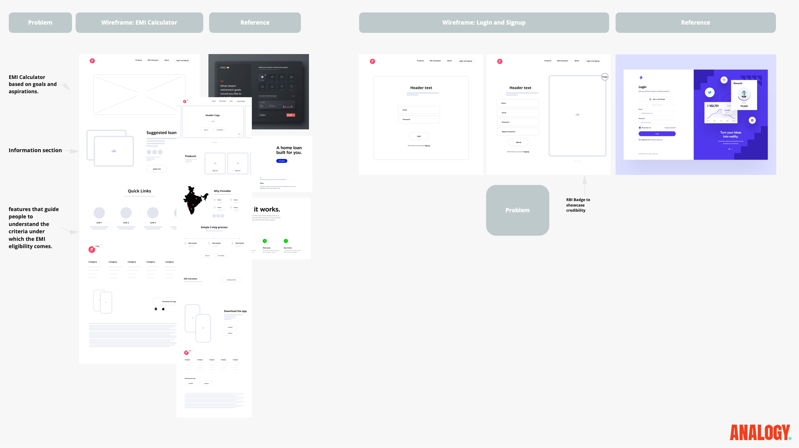
Prototypes as hypotheses

Each wireframe was framed as a hypothesis: if we reduce uncertainty here, the next action should feel safer and easier. That made critique more focused than simply comparing screen variants.
Problem-based wireframing also helped the team keep user hesitation visible throughout design review.
Eligibility calculator
Letting users understand fit earlier
The eligibility calculator concept helped users understand fit earlier in the journey, reducing unnecessary application effort and improving the quality of intent before deeper form steps.
This was a trust decision as much as a conversion decision. A clearer answer upfront can make the rest of the journey feel more respectful.

Shortening the process
Faster decisions with better data use
Existing user data created opportunities to abbreviate steps while preserving personalization. The redesign direction used that data carefully: fewer repeated questions, clearer context, and more confidence in the next step.
The strategy was not to hide the seriousness of a financial decision; it was to remove avoidable friction around information the product could already infer or explain better.

Custom imagery
Making finance feel approachable without becoming vague

Tailored visuals aligned the experience with core demographics and supported a more approachable financial tone. The imagery needed to humanize the journey without distracting from terms, eligibility, and repayment clarity.
Final product direction
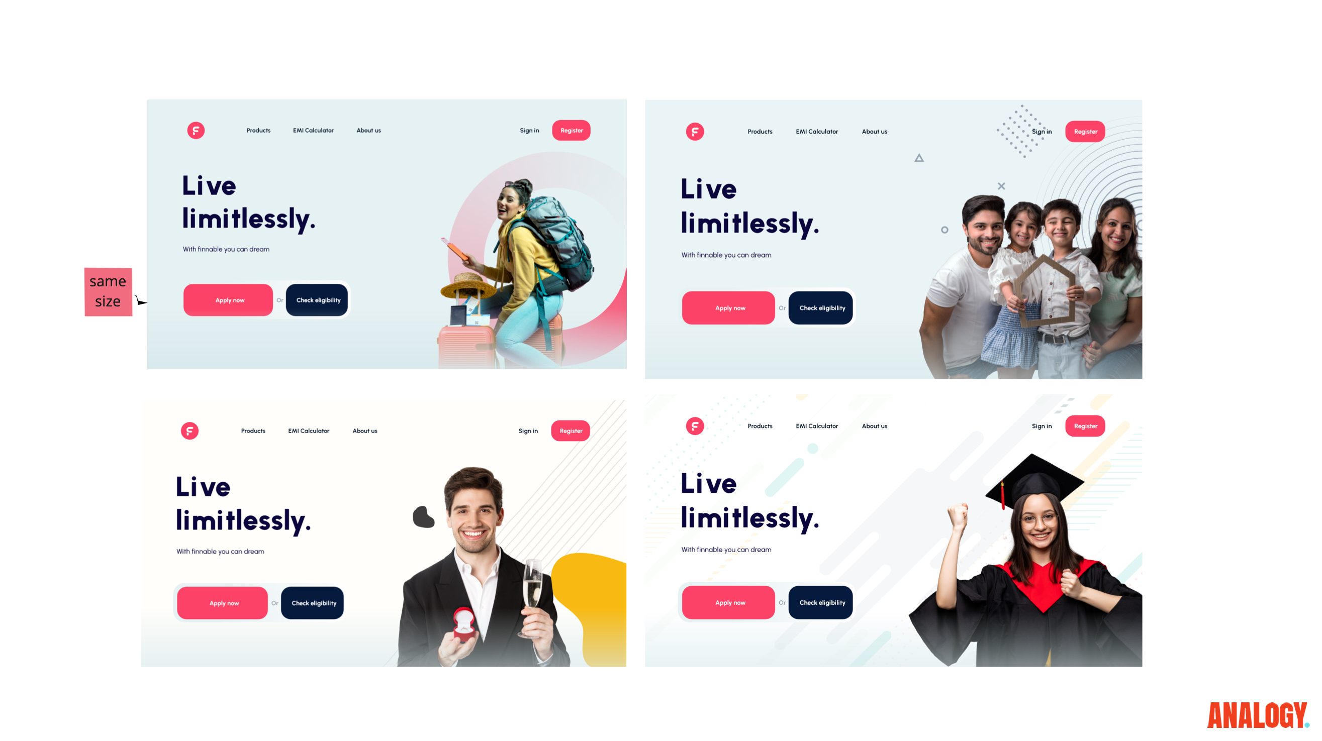
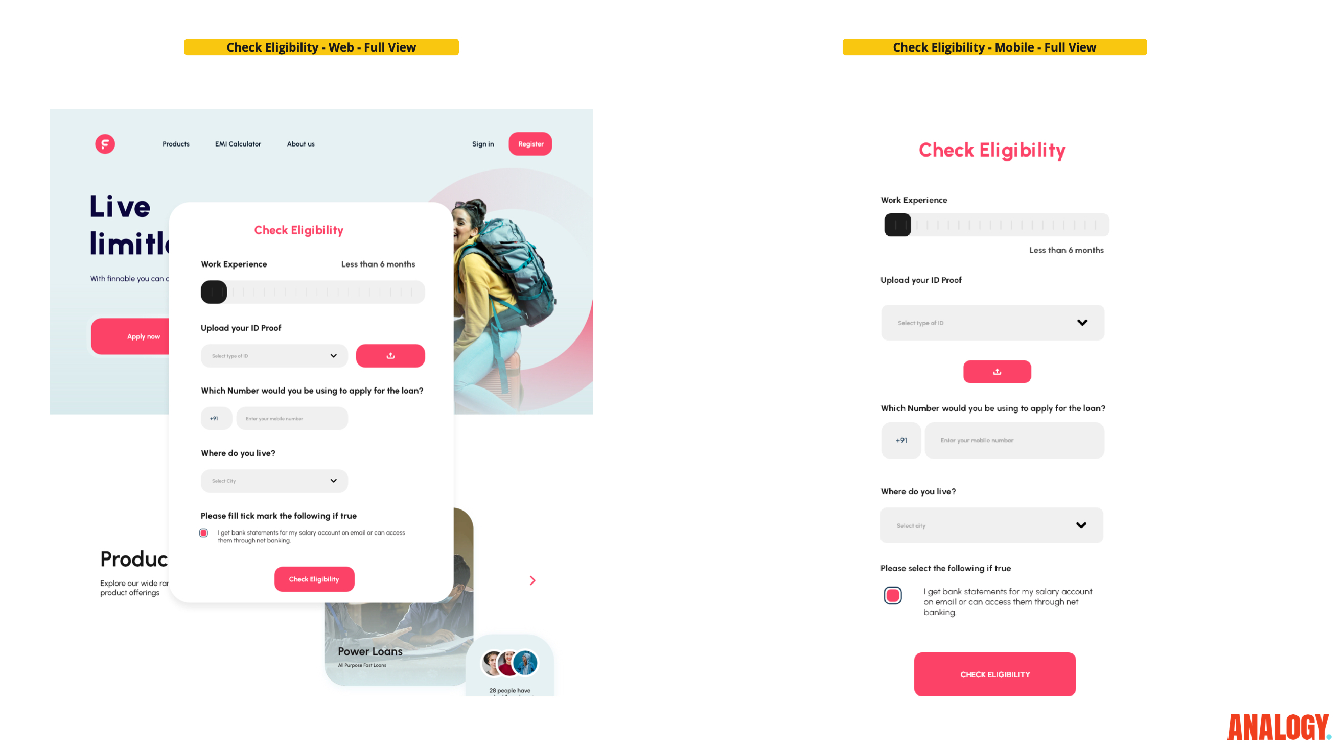
A clearer loan experience to execute
The final direction brought the audit, information architecture, eligibility concept, shorter process, and visual trust language into a more coherent product experience.
Because the available source material does not include hard conversion numbers, the portfolio should frame impact honestly: clearer journey structure, stronger trust moments, and a more actionable product direction for the Finnable team.

Reflection
What changed in the product direction
The work shifted the conversation from isolated screens to a trust-building journey. By tying each redesign move to a specific moment of user hesitation, the team could prioritize changes that made the application feel clearer and more human.
For portfolio representation, Finnable should stay highly process-led, but the ending needs product proof. The final image closes the loop so the audit work does not feel like a Miro-only exercise.
More to explore
Insane AI.
Rebuilt a motion-led fitness product foundation around brand, feedback, and repeat engagement.
Panasonic Miraie.
Designed a smart-home experience that made advanced controls approachable for Indian households.
Quambio.
Turned carbon-saving commutes into a visual reward system people could understand and repeat.
How to create a culture for creative growth.
Shifting from output metrics to quality and learning to cultivate stronger design outcomes.