Case study / Insane AI
Insane AI.
Rebuilt a motion-led fitness product foundation around brand, feedback, and repeat engagement.
Duration
Jun-Sep, 2023
Client
Insane AI
Category
Interaction
Year
2023

Challenge
Make AR fitness feedback feel energetic, social, and motivating without adding cognitive load while users are moving.
Approach
Aligned the brand through style scapes, grouped features around insight-led loops, and translated motion tracking, progress, challenges, and social mechanics into a scalable product system.
Outcome
Established a brand-led product foundation for real-time feedback, routines, social spaces, and progression mechanics that could scale beyond isolated feature screens.
Scope
Led brand strategy, product interaction direction, design-system structure, and validation planning with brand and research partners.
Overview
A scalable system for motion-led fitness
Insane AI combined gamified fitness, front-camera motion tracking, AR feedback, and social competition. The design challenge was to make that complexity feel coherent: a brand system energetic enough for social fitness, a UI light enough for workouts, and interaction patterns that could guide movement without distracting from it.
Role
Design Lead & Project Manager
Services
Brand Strategy · Interaction Design · Design Systems
Team
Brand Designer · UX Researcher
System
Brand, UI, and interaction patterns organized into a reusable product language.
Foundation
Motion
Feedback patterns focused on workout clarity, timing, and low cognitive load.
Interaction core
Social
Challenges, routines, progression, and social spaces structured around repeat participation.
Engagement loop


Context
Fitness feedback had to work while users were moving
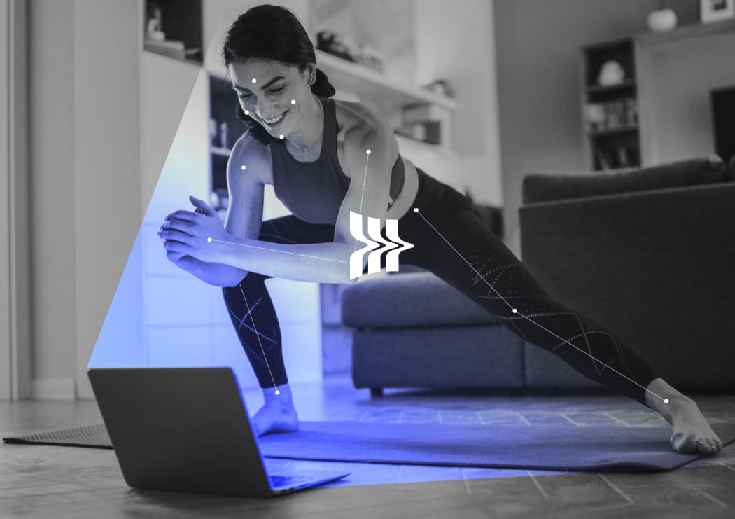
Insane AI blends social fitness with gamified AR, motion tracking, and real-time feedback. The app uses the front camera to track movement, measure performance, and respond while a user is exercising.
That creates a demanding interface problem. The product has to motivate, correct, reward, and invite repeat sessions without competing with the workout itself. The work focused on rebuilding the product foundation so brand, interaction, progression, and social mechanics could operate as one system.
Brand in UX
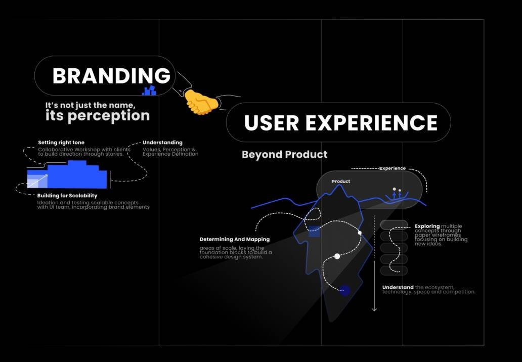
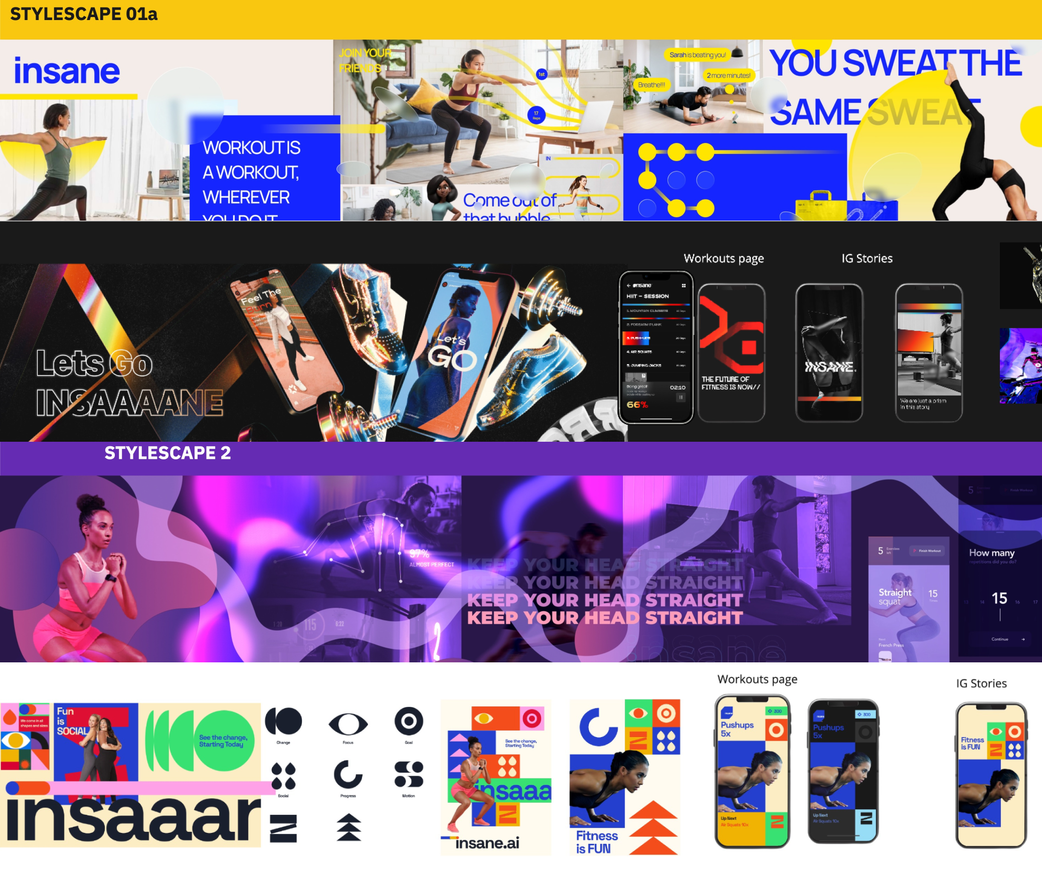
Translating energy into usable product language

The brand could not live only in marketing assets. It needed to shape the product's interaction language: how progress felt, how achievement was shown, and how competitive energy appeared without overwhelming the user.
We translated brand attributes into UI components, motion cues, visual hierarchy, and feedback states so the app could feel recognizable across onboarding, workouts, social spaces, and rewards.
Feature groups
Organizing complexity around user and business goals
The product had many possible directions: AI feedback, workouts, challenges, routines, social competition, progress, and brand storytelling. We grouped features around insight-led loops so teams could see which ideas supported behavior and which ones were just extra surface area.
This gave the roadmap a clearer product logic: help users start, guide them during motion, reward completion, and bring them back through routines and social motivation.

Style scapes
Aligning emotion before screens became expensive
Style scapes helped leadership align on the emotional direction of the product before detailed interface production. That mattered because the app needed to feel active and ambitious without turning every screen into a high-intensity visual moment.
The style work also acted as a design-system foundation. Once the direction was clear, product assets, progress states, and feature screens could share the same visual DNA.

Stakeholder sessions
Making usability decisions visible
We used stakeholder sessions to translate business goals, usability concerns, and feature ambitions into flows and wireframes. That created a shared place to evaluate product behavior before interface polish made decisions harder to change.
The work helped separate what users needed during a workout from what the business needed around engagement, retention, and brand expression.

Prototype loop
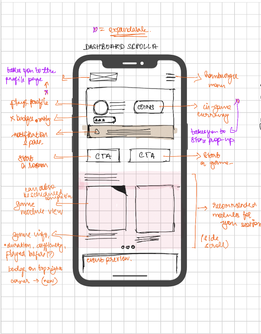
Experiment, prototype, test, record, implement
Because many features had few reliable benchmarks, we treated prototypes as product hypotheses. Ideas were sketched, tested, recorded, and refined with stakeholders before becoming system patterns.
This loop was especially useful for motion-led feedback, where a conventional app pattern could be technically correct but still fail when a user is mid-exercise.

Systems and guidelines
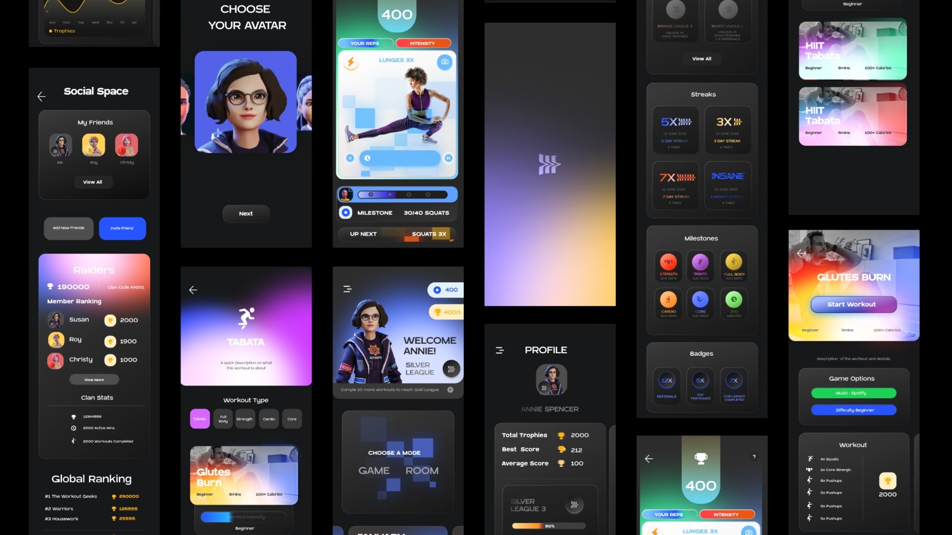
A product kit built for scale

Before moving into final UI, we created a system that could support product growth. Components, visual assets, and guideline patterns were organized around clarity, brand recognition, and repeatable interaction states.
The design system gave future features a consistent foundation instead of forcing every new workout or challenge screen to be solved from scratch.
Design system in motion
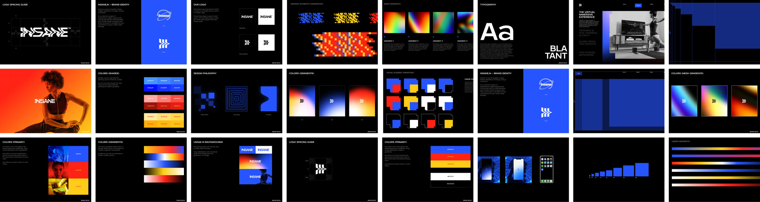
Guidelines that could become product assets
The system was also treated as a production tool. Static rules, motion studies, visual elements, and product components needed to connect so the team could build future workout and challenge surfaces from the same foundation.

Interaction framework
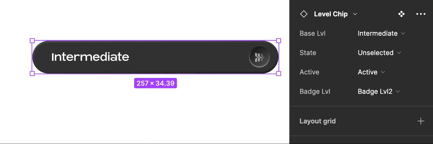
Principles for movement-first UI
The interaction framework clarified how the UI should behave around movement: guide before the action, give feedback during the action, and reward after the action. Each state had to be visible, fast to parse, and consistent with the brand.
This kept the interface from becoming a collection of one-off workout screens. The framework made product decisions easier because new features could be evaluated against the same movement-first principles.

Scalable systems
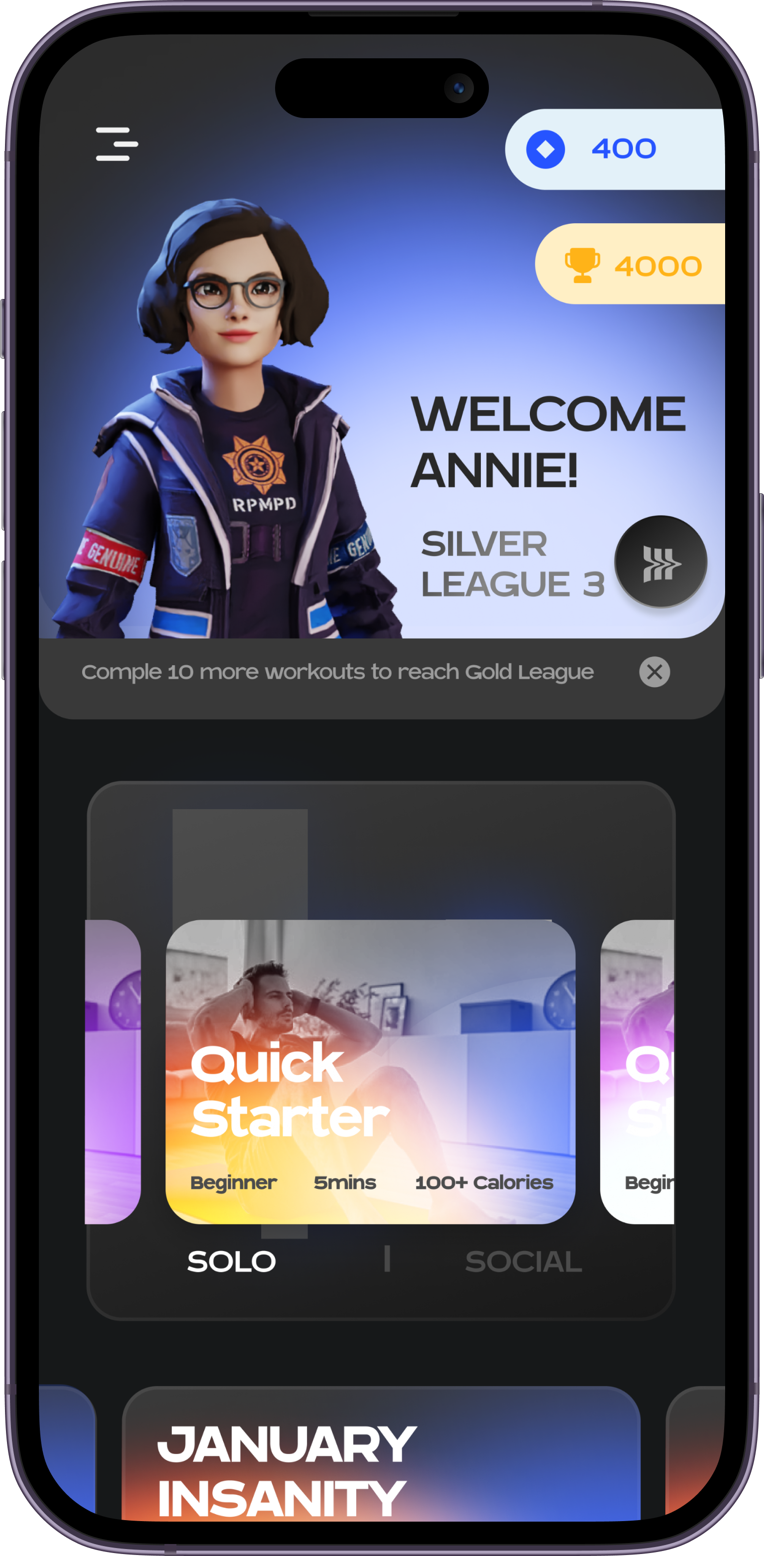
Progress mechanics that carry the brand
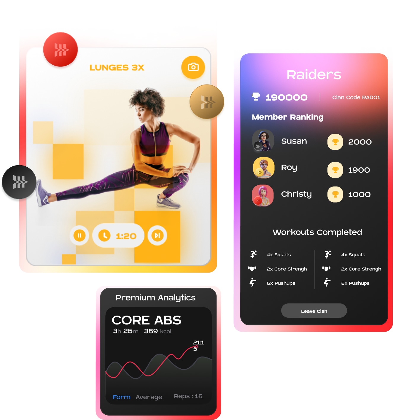
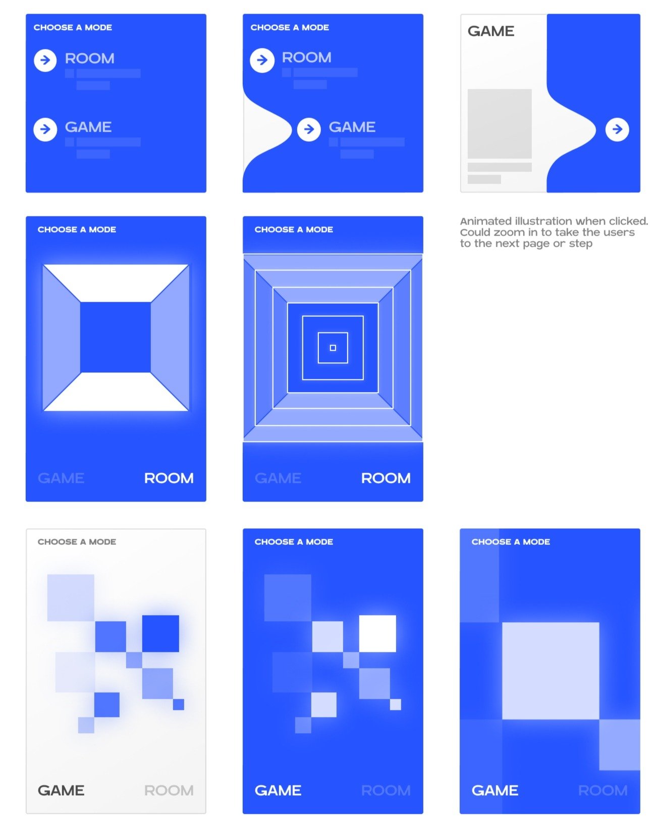
Progression was designed as more than a status label. Brand elements, levels, and achievement language became part of the motivation system, helping users understand where they were and why another session mattered.
This let the product scale into new routines and challenge types without losing a recognizable reward language.

Social spaces
Combining the workout world and community space
The experience needed to support both individual routines and social competition. We designed social spaces around motivation rather than feed consumption: users should be able to compare, participate, and return to goals without being pulled away from the workout context.
Balancing technology, game mechanics, and social behavior was one of the central product constraints. The system had to feel energetic, but the workout still needed to remain the user's main focus.
Challenges and routines
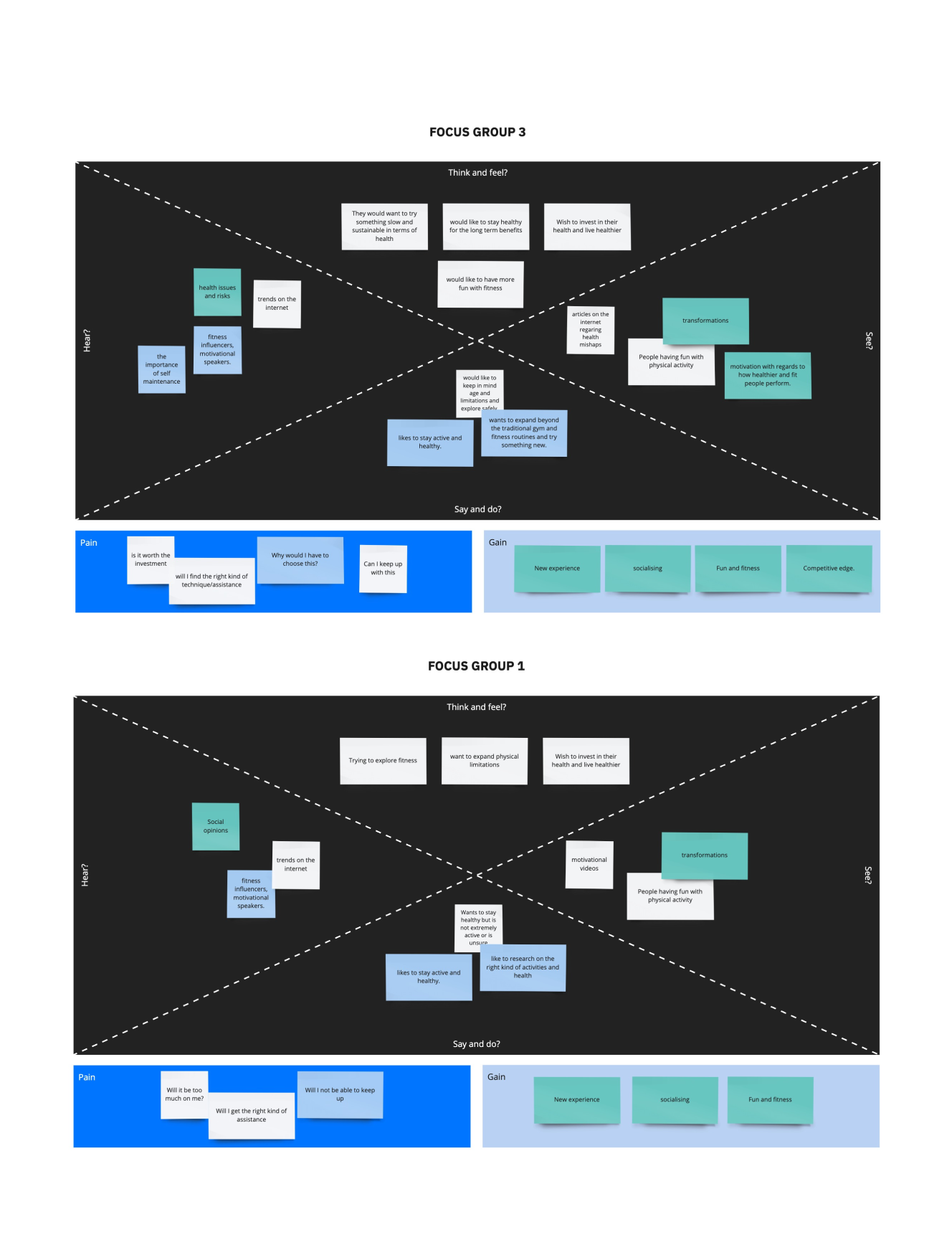
Designing from real workout scenarios

Scheduling challenges for individuals and teams required a grounded understanding of workout behavior. We modeled routines from real fitness scenarios, then simplified the interface around day-by-day navigation and clear instructions.
The goal was to make challenges feel achievable and repeatable, not like another planning burden added on top of exercise.
Routine levels
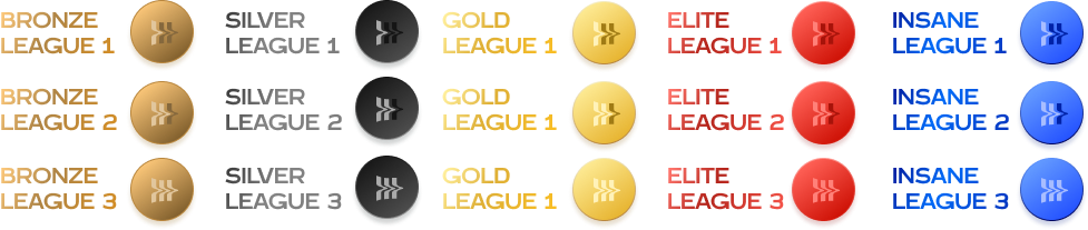
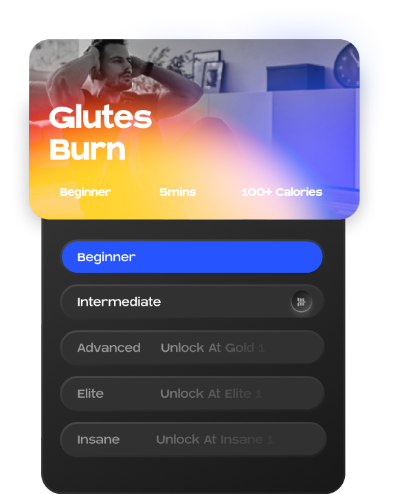
Unlocking difficulty without overwhelming new users
The level system let the product expose more demanding routines gradually. Beginners could start with approachable workouts, while advanced users had visible progression paths that gave the brand's game mechanics a practical purpose.

Impact and reach
A clearer foundation for the product
The final direction gave Insane AI a more coherent system for brand, feedback, social motivation, and product growth. Instead of isolated visual screens, the team had a foundation for real-time movement feedback, routines, levels, and social engagement.
The strongest evidence for this case is the system thinking behind the UI: brand did not decorate the product after the fact; it organized how users understand progress, motivation, and participation.

Reflection
What held the product together
The project became stronger once brand and interaction were treated as the same system. The visual language created energy, while the interaction model kept attention on movement, feedback, and repeat engagement.
For portfolio representation, this case should show process and systems together. The images work best as a chain of decisions: brand role, feature groups, style direction, stakeholder alignment, prototype loop, guidelines, interaction framework, progression, and impact.
More to explore
Finnable.
Reframed a loan application journey around trust, clarity, and fewer moments of hesitation.
Panasonic Miraie.
Designed a smart-home experience that made advanced controls approachable for Indian households.
Quambio.
Turned carbon-saving commutes into a visual reward system people could understand and repeat.
How to create a culture for creative growth.
Shifting from output metrics to quality and learning to cultivate stronger design outcomes.