Case study / Panasonic
Panasonic Miraie.
Designed a smart-home experience that made advanced controls approachable for Indian households.
Duration
May-Aug, 2023
Client
Panasonic
Category
Product Design
Year
2023

Challenge
Make a first-time smart-home system feel familiar on lower-end Android devices without hiding the depth of automation, diagnostics, and household control.
Approach
Built the experience around staged capability: everyday controls first, then widgets, automation, sleep cycles, troubleshooting, and analytics as users gained confidence.
Outcome
Delivered a scalable Miraie product experience recognized by Red Dot, with a localized interaction model for daily use across Indian households.
Scope
Led the design direction, project planning, research synthesis, interaction model, and stakeholder alignment across Panasonic, Tata Elxsi, and an external research partner.
Overview
A local smart-home experience with global product standards
Panasonic needed a connected-home product that could serve families who were new to smart devices while still supporting richer automation and appliance intelligence. I led the design process from research synthesis through interaction definition, aligning multiple partner teams around a staged product experience: simple controls first, advanced capability when the user was ready.
Role
Design Lead & Project Manager
Services
Product Design · Interaction Design · Research
Team
UI Designer/Illustrator · Researcher · UX Designer · External Research Agency · Tata Elxsi · Panasonic IIC
Red Dot
International recognition for the Miraie product experience and interaction approach.
Recognition
3
Active, passive, and power-user patterns shaped the information architecture.
User modes
6
Panasonic, Tata Elxsi, research, UX, UI, and illustration workstreams were aligned into one delivery process.
Workstreams


Context
Connected living had to start from everyday habits
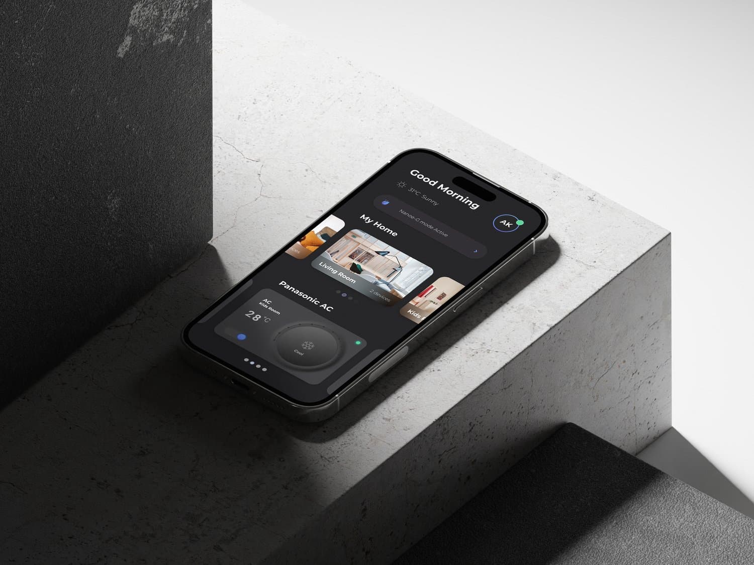
Miraie was not simply a remote control for appliances. It had to help households move from occasional device control to confident connected-home behavior across routines, rooms, and family members.
The challenge was especially local: many users were new to smart-home systems, devices had to perform on lower-end phones, and the interface needed to feel modern without asking people to learn an abstract control language before they could complete a basic action.
Process evidence
A delivery model built around decisions, not decoration
I adapted the design plan around Panasonic's decision structure. The team combined consumer insights, product constraints, workflow mapping, and sprint reviews so research findings could become wireframes, stakeholder decisions, and shipped interaction patterns.
This gave the project a shared operating rhythm: learn what mattered in homes, translate appliance functions into user flows, review the flows with leadership, and refine the interface around what users could understand quickly.

Research
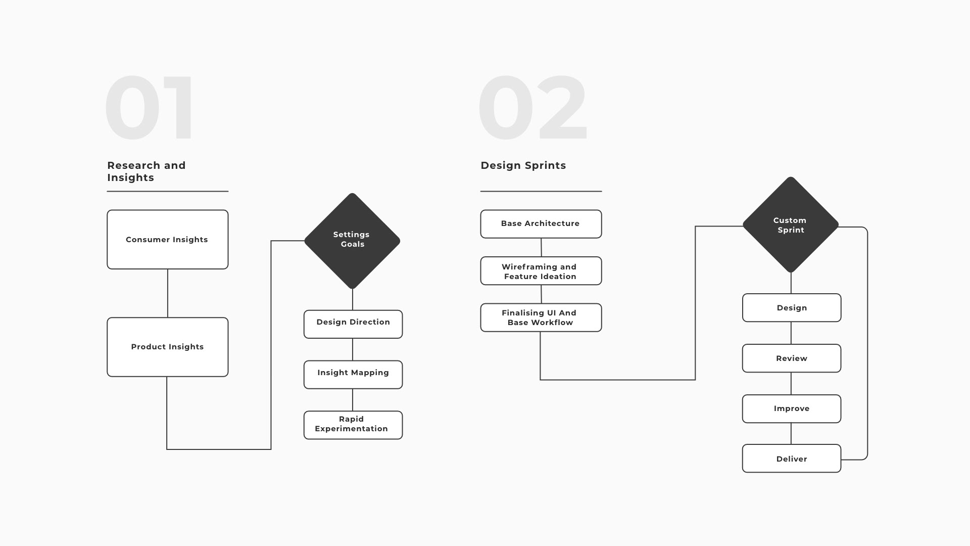
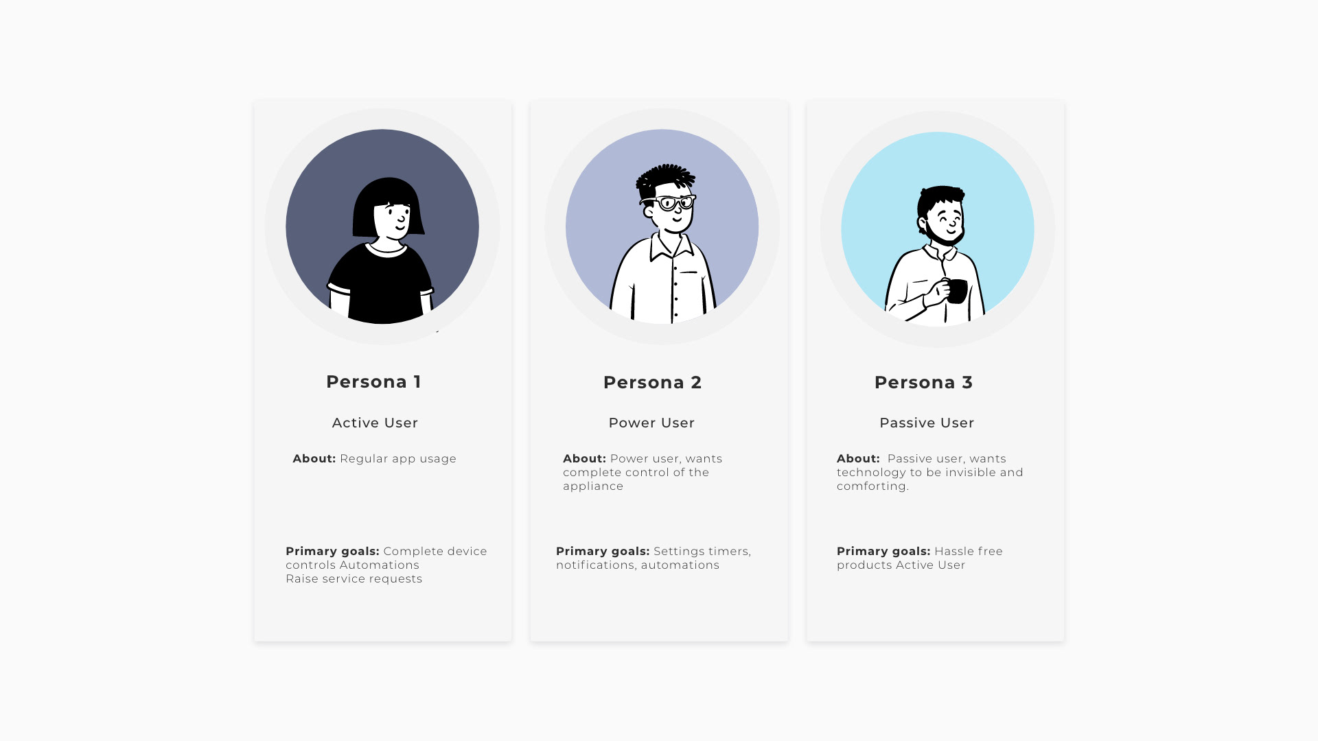
Segmenting active, passive, and power users

Research separated users by control confidence and frequency of use. Passive users needed reassurance and simple defaults. Active users needed fast daily access. Power users needed automation, diagnostics, and analytics without forcing that depth onto everyone else.
That segmentation shaped the product hierarchy. Frequently used actions stayed visible, while advanced capabilities were introduced progressively through contextual paths and repeat-use patterns.
Interaction building blocks
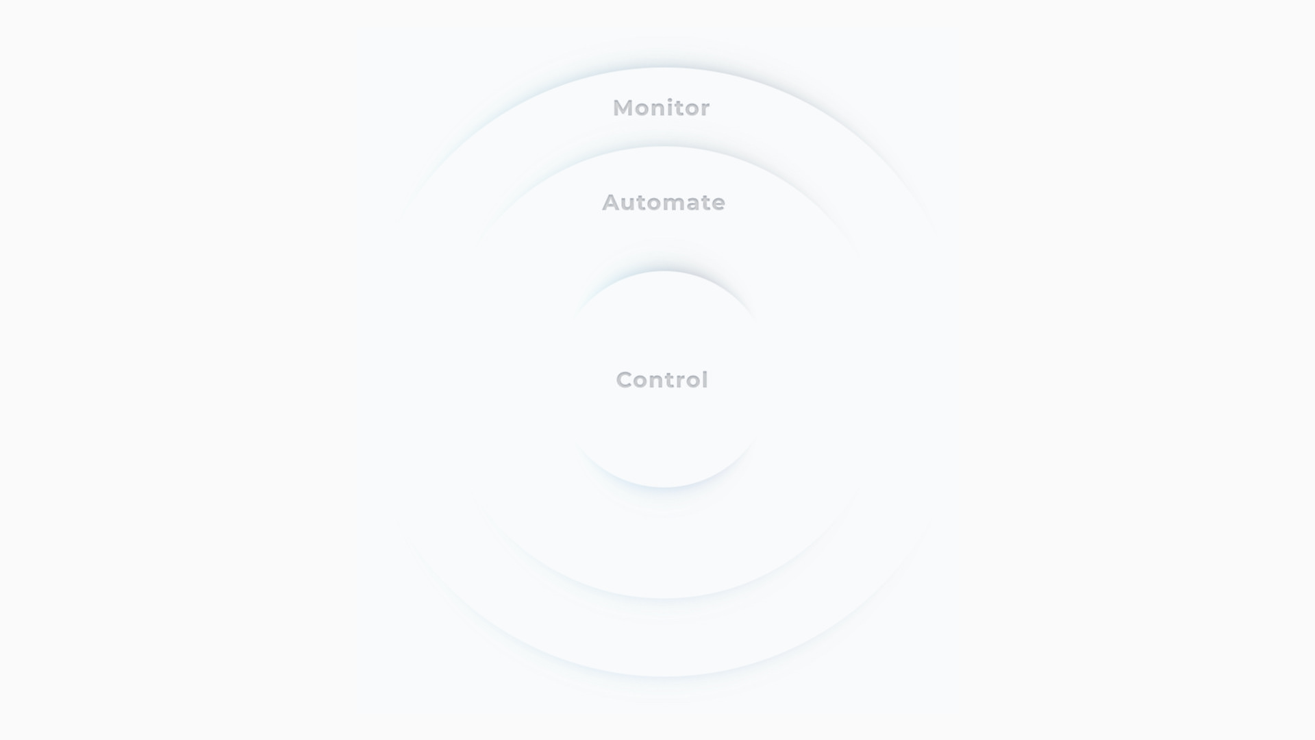
Control, monitor, automate
The interaction model organized the app around three levels of intent: control the device now, monitor what is happening, and automate repeated behavior. That structure helped the team keep daily actions fast while preserving the more advanced promise of a connected-home ecosystem.
The result was a product logic that could support simple room/device access, repeated appliance routines, and deeper capabilities such as sleep cycles, troubleshooting, and data analytics.

Journey model
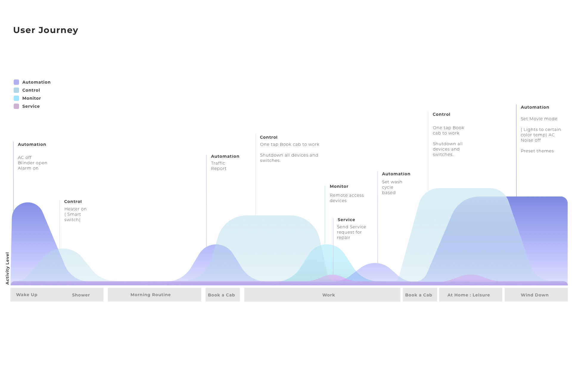
Designing for a full day of household use
The journey model mapped control, monitoring, automation, and service moments across a day. This helped the team see where smart-home behavior happened naturally instead of treating every feature as a destination in the app.
It also clarified when the interface should be quiet, when it should surface a status change, and when it should invite a user toward a more advanced routine.

Stakeholder alignment
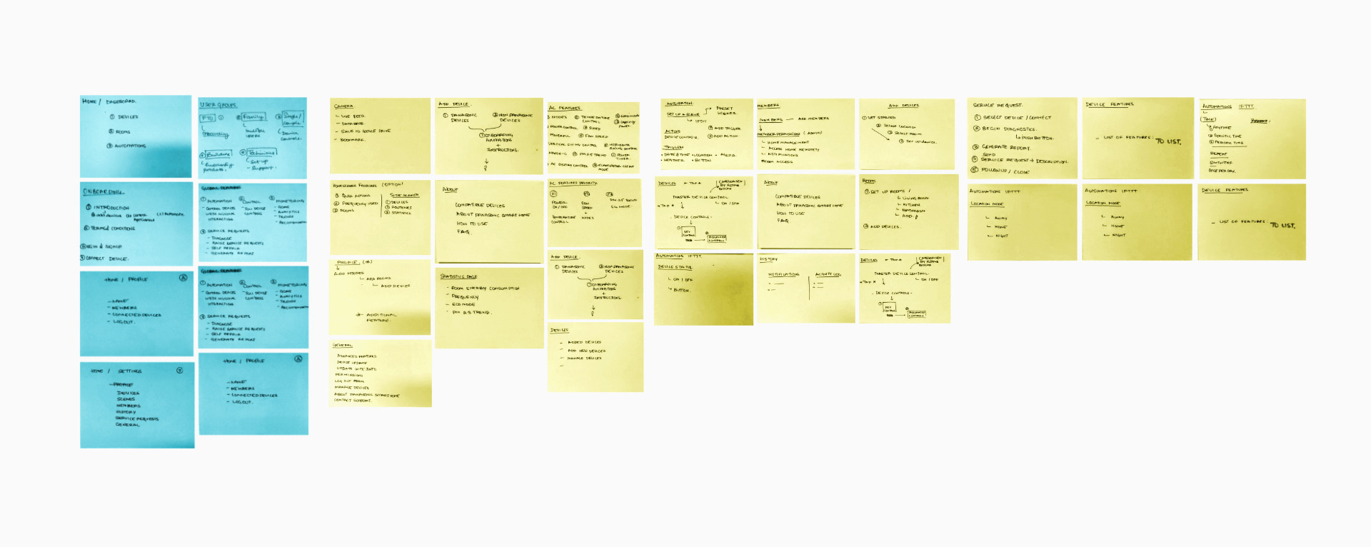
Turning leadership sessions into flows
Leadership and stakeholder sessions were used to make usability issues explicit. We translated appliance functions into user flows, wireframes, and workshop artifacts so Panasonic and partner teams could critique behavior before screens became polished.
This was important because the product crossed multiple responsibilities: device capability, marketing expectations, user research, and interface delivery all needed to converge around one experience.

Market data
Designing with adoption realities

Market and marketing inputs helped ground interaction decisions in how the product would be introduced to Indian consumers. The work had to balance brand ambition with practical adoption: users needed to see value quickly, not only after configuring a complex smart-home setup.
Those inputs reinforced the staged-complexity strategy. The first-run experience had to make the system feel useful and safe; later sessions could reveal deeper capabilities.
Field research
Homes shaped the product, not benchmarks alone
Interviews and home visits revealed how devices are shared, checked, and controlled in real environments. The product had to respect the way families already moved between rooms, appliances, and routines.
This research protected the app from becoming a generic smart-home dashboard. The strongest patterns came from everyday behavior: quick checks, repeated controls, household context, and the need for clear device status.

Experiment-led validation
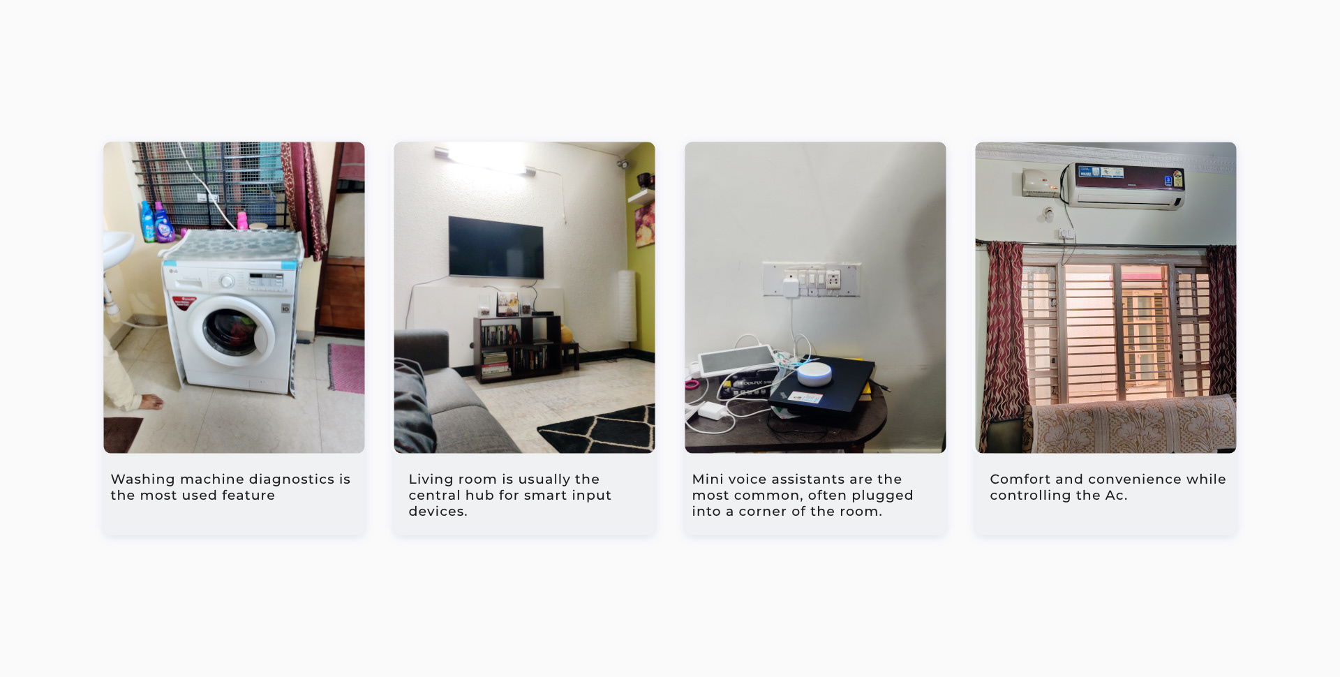
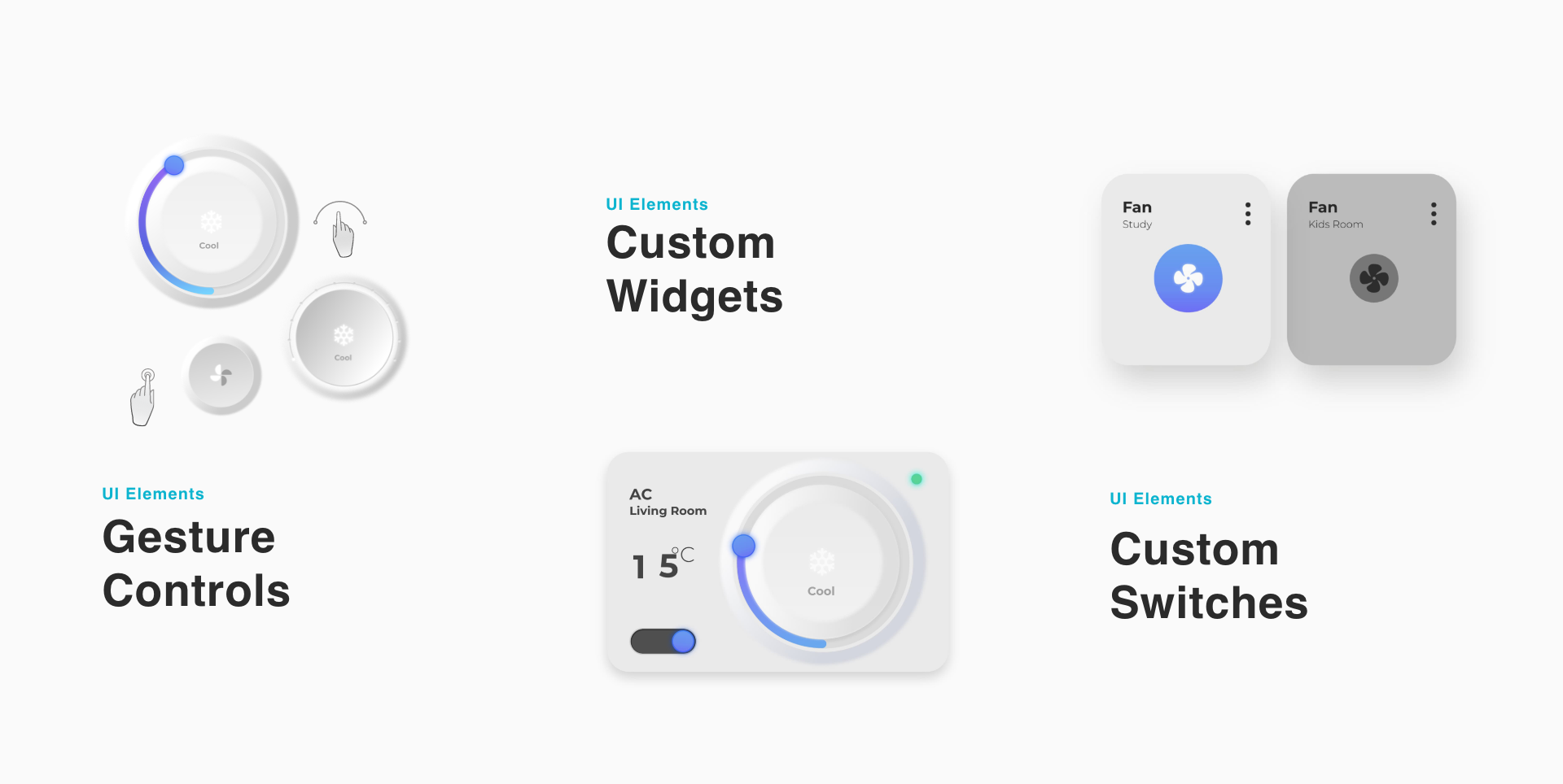
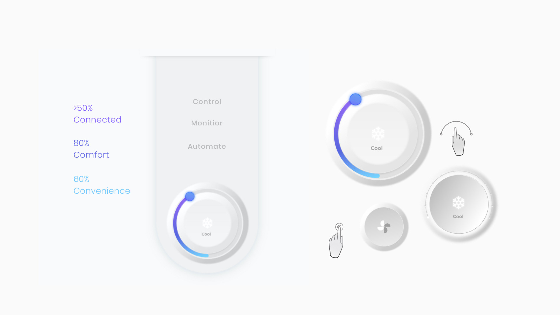
Testing physical metaphors before committing
We tested concepts that recreated familiar physical interactions from Indian homes: switchboards, thermostats, appliance states, and room-based control. The point was not nostalgia; it was reducing the learning curve for digital control.
The validation loop helped identify which metaphors made actions more understandable and which ones added visual weight without improving confidence.

Familiar objects
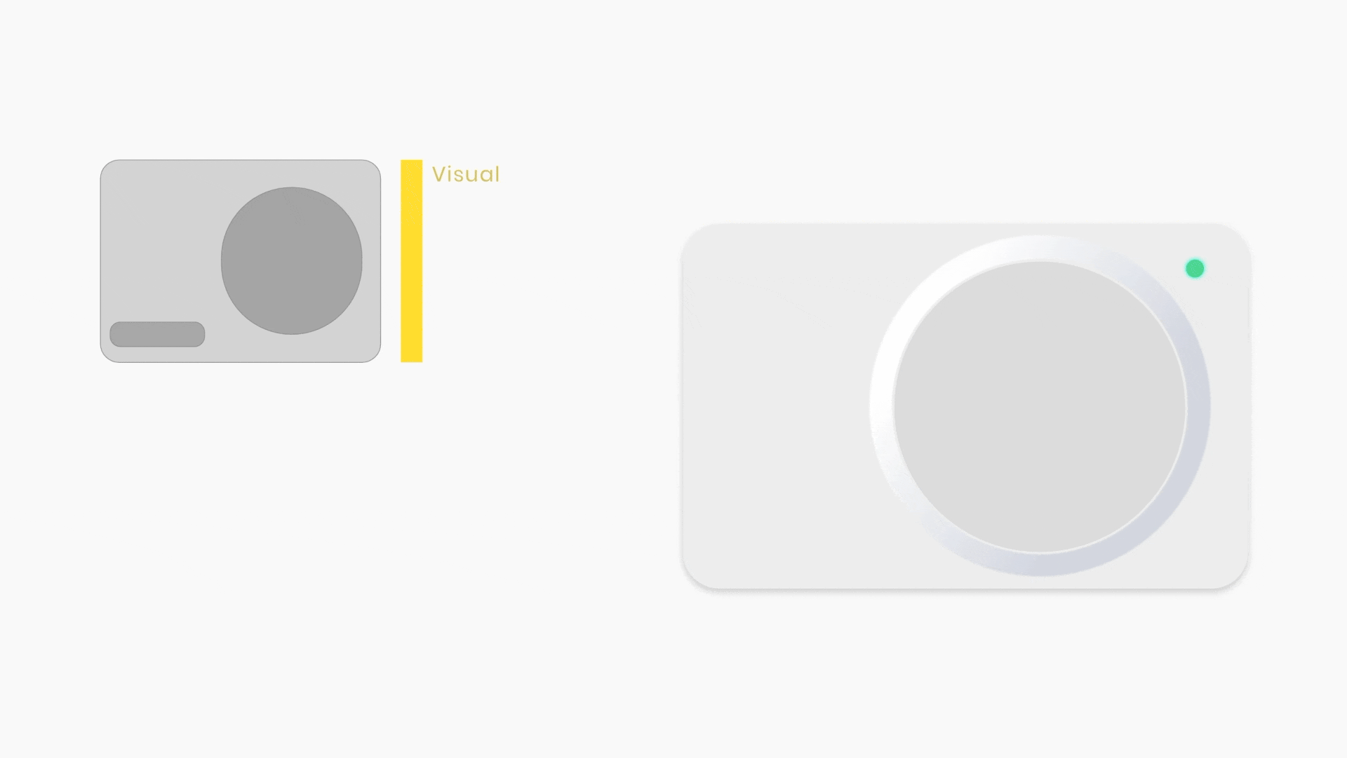
Digital controls that borrowed from the home

The interface used soft physical metaphors for familiar household controls. Switchboards, thermostats, and appliance states gave users a recognizable starting point before introducing richer digital capability.
This helped the product feel local without becoming visually heavy. Familiarity was used as an onboarding bridge, not as a constraint on the future system.
Widgets
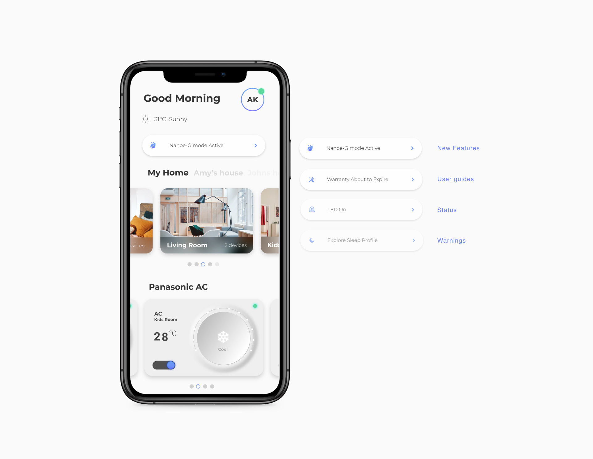
A dashboard for different levels of intent

The dashboard used widgets to separate primary controls from secondary options. Taps and swipes gave users visible feedback without filling the home screen with every possible setting.
This let the app support three user groups at once: passive users could complete simple actions, active users could repeat daily controls quickly, and power users could reach deeper tools when they needed them.
Multi-gesture navigation
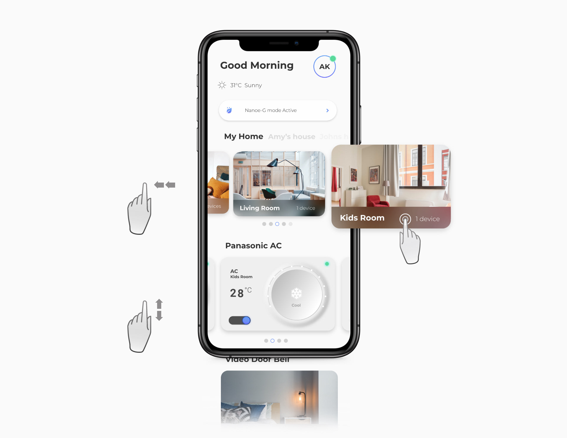
Room and device access without heavy menus
Room and smart-item navigation used layered gestures to make appliance access feel direct. The interaction model gave users a sense of control and feedback while avoiding deep menu structures.
The design decision was practical: a smart-home app becomes valuable when repeat actions feel nearly invisible, but users still understand where they are and what changed.

Product principle
The product needed to surface vital status and next-best actions as helpful nudges, not as a noisy layer of notifications.

Reflection
What made the system stronger
The strongest design decision was the staged capability model. By clarifying what belonged to first use, daily use, and power use, the team could make a capable smart-home system feel understandable without stripping away its depth.
For portfolio representation, this case should lead with the product proof and then show the research/process evidence as decision support. The Webflow assets are strongest when they are treated as evidence chapters: personas, interaction hierarchy, field research, validation, widgets, gestures, and nudges each answering a specific design decision.
More to explore
Finnable.
Reframed a loan application journey around trust, clarity, and fewer moments of hesitation.
Insane AI.
Rebuilt a motion-led fitness product foundation around brand, feedback, and repeat engagement.
Quambio.
Turned carbon-saving commutes into a visual reward system people could understand and repeat.
How to create a culture for creative growth.
Shifting from output metrics to quality and learning to cultivate stronger design outcomes.