Case study / Quambio
Quambio.
Turned carbon-saving commutes into a visual reward system people could understand and repeat.
Duration
2021, archived in 2023
Client
Quambio
Category
Interaction
Year
2021

Challenge
Make invisible CO2 savings feel concrete enough to motivate everyday walking, cycling, and low-emission travel behavior.
Approach
Built the experience around cube rewards, weekly progress, activity modes, adaptive themes, and group challenges.
Outcome
Moved the product from zero-to-one into beta with a coherent reward loop and a Good Design-recognized product story.
Scope
Led product strategy, reward mechanics, brand-system direction, and interaction design with the development partner.
Overview
Designing motivation for lower-carbon travel
Quambio needed more than a CO2 tracker. The product had to translate invisible environmental value into a reward system that felt immediate, legible, and social. I shaped the app around a clear visual economy: users make sustainable trips, receive cube points, watch progress accumulate, and join challenges that make individual behavior feel part of a larger goal.
Role
Design Lead & Project Manager
Services
Interaction Design · Product Strategy · Brand System
Team
Analogy · Hummingwave (Dev)
0-1
Ground-up mobile experience taken into beta testing.
Product stage
2021
Good Design recognition for the CO2 tracker product experience.
Recognition
4
Tracking, rewards, adaptive themes, and challenges tied daily action to visible progress.
Motivation loops


Context
Sustainable behavior needed visible feedback
Quambio encouraged people to choose lower-emission ways to move through a city, but the product value was hard to feel in the moment. CO2 savings are abstract, and abstract progress rarely changes a routine on its own.
The design challenge was to make walking, cycling, or choosing an electric scooter feel measurable, rewarding, and connected to a larger climate goal without turning the product into a dense environmental dashboard.
Visualizing carbon offset
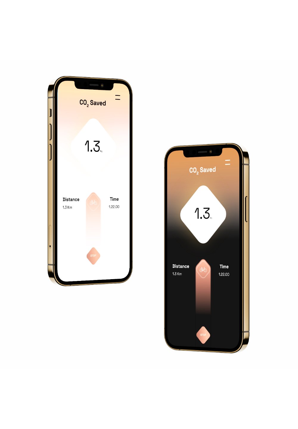
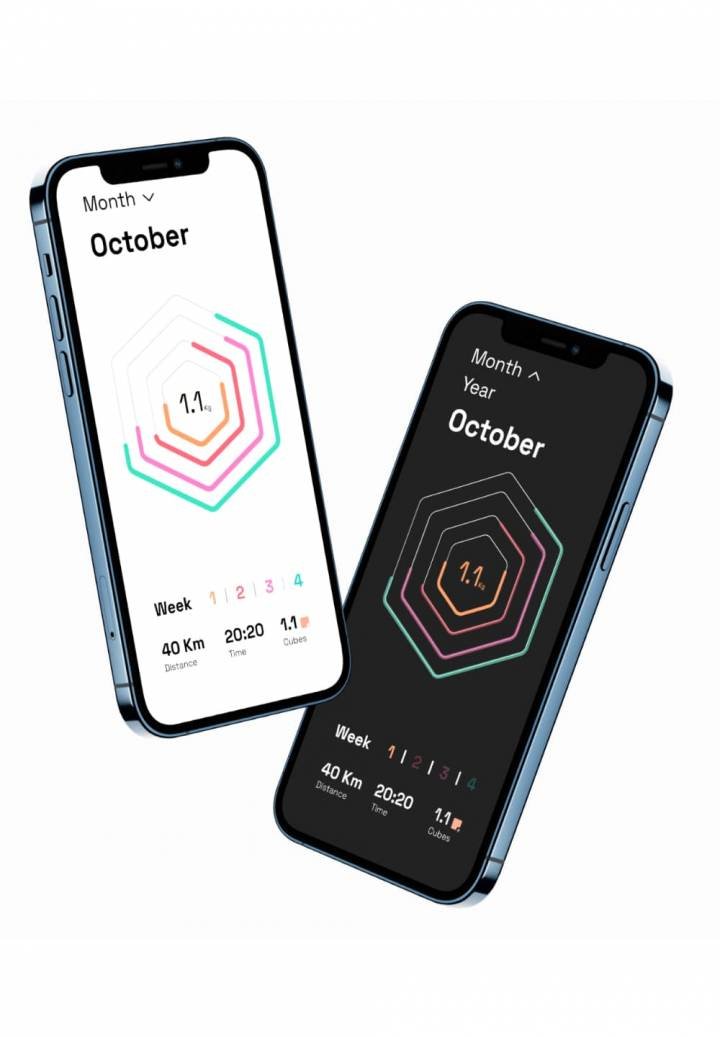
The cube became the unit of understanding

The cube motif translated emissions into something users could picture. Instead of presenting only grams, charts, or abstract sustainability language, the product used a visual unit that could represent saved CO2, reward progress, and collective impact.
That visual language made the rest of the system easier to understand: activity creates savings, savings become cube points, and cube points show progress toward a more sustainable routine.
Dashboard
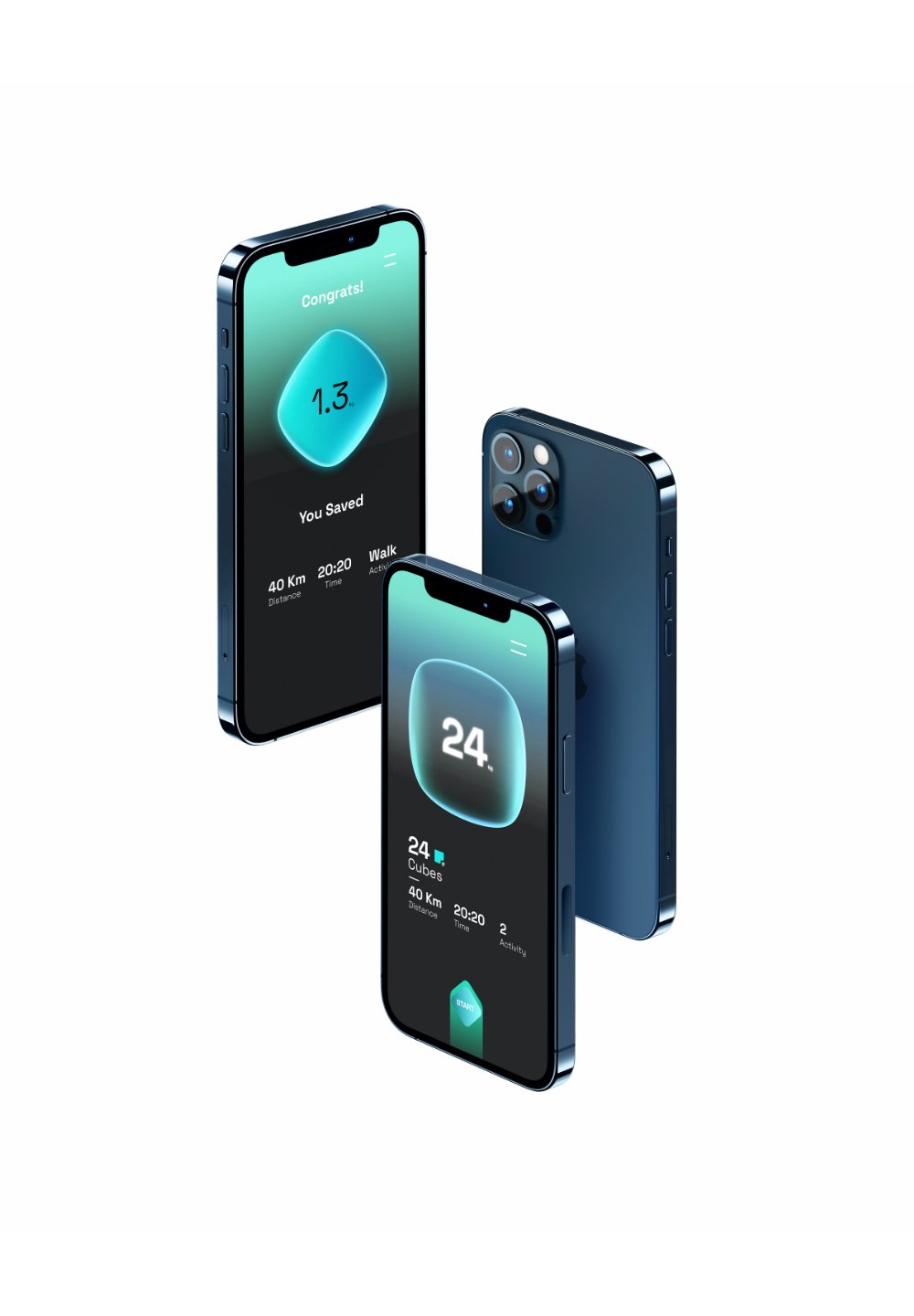
Weekly stats in a single view
The dashboard centralized weekly distance, time, and cube points so users could understand progress in one scan. The goal was to make impact visible without forcing people through split infographics or heavy reporting screens.
This single-view strategy supported the product's core behavior: return, check progress, and start another low-emission activity.

Activity tracker
Turning a commute into a deliberate choice
Users could choose walk, cycle, or other low-emission modes and immediately see the CO2 savings tied to that decision. The interaction reframed the commute as a repeatable contribution rather than a one-off activity.
The tracker balanced action and reflection: start the trip quickly, then return to evidence of what changed.

Rewards
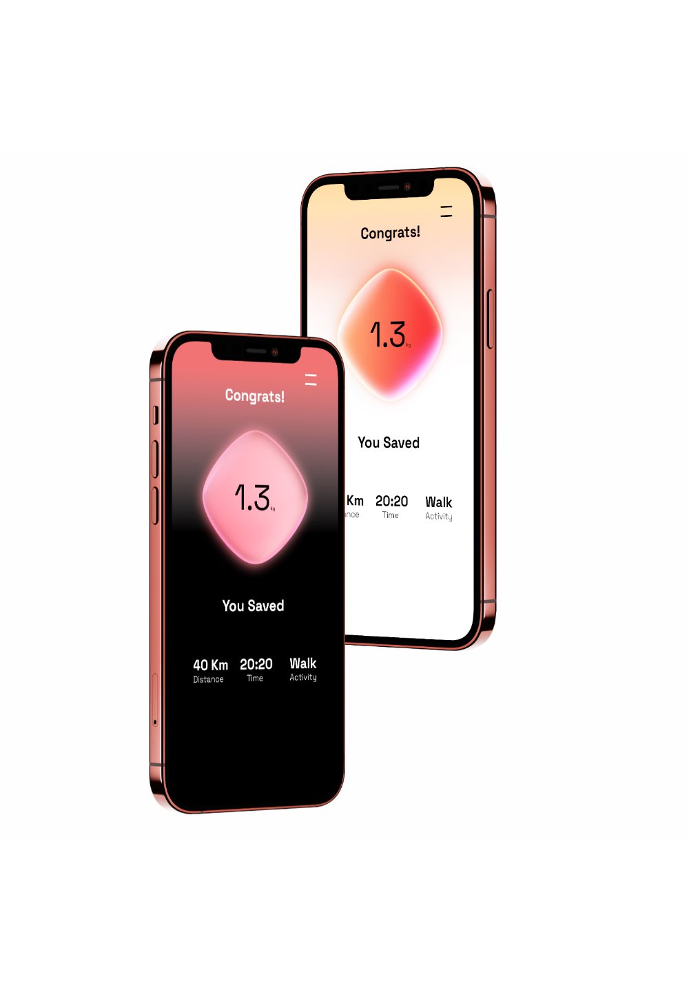
Making sustainable action worth repeating

Cube points gave the system a lightweight game mechanic. The loop was intentionally simple: move sustainably, earn visible progress, unlock rewards, and return to improve the result.
Rewards also helped the product move beyond awareness. The app was not only explaining emissions; it was giving users a reason to choose a better transport behavior again.
Adaptive themes
Progress that changes the interface
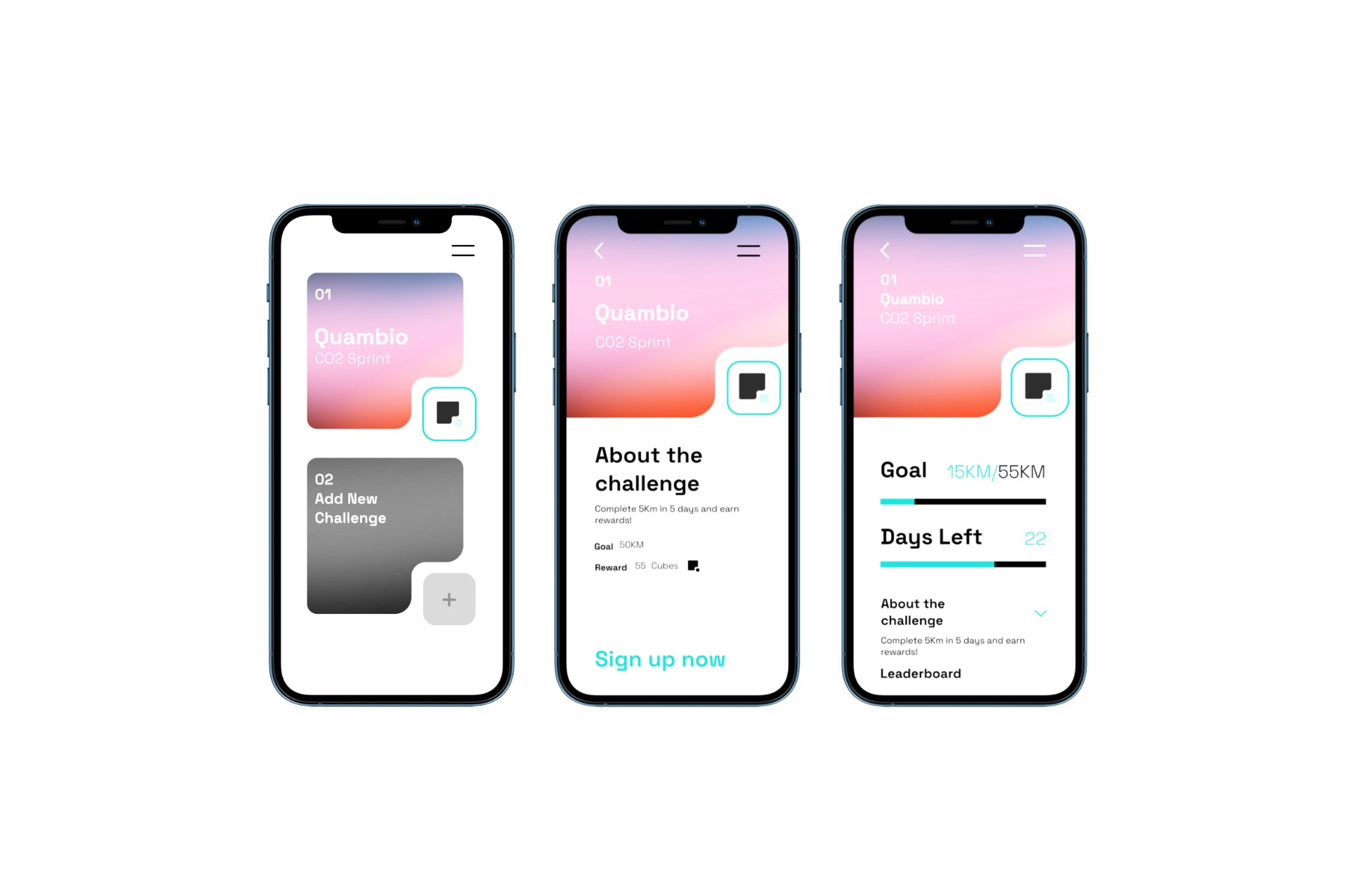
Quambio's adaptive themes made progress visible outside a stats view. As users created more CO2-saving activities, the interface could shift visually, giving long-term use a sense of movement and accumulation.
This turned the brand system into feedback. The interface itself became a signal that the user's behavior was changing something.
Challenges
Shared goals without heavy social pressure
Group challenges created shared momentum around environmental goals. The design kept the mechanic lightweight so it supported commitment without making the app feel like a social feed.
Challenges were useful because sustainable behavior often benefits from social context. The system let users participate, compare impact, and contribute to a shared climate goal while keeping the core task focused.
Impact and press
Recognition without muddying the timeline
The Good Design recognition is from 2021; the 2023 date on the old Webflow page appears to be the portfolio archive/publish date, not the award year. The current portfolio should show the project as 2021 and use the duration field to clarify that it was later archived in 2023.
This matters because recognition is a proof point only when the timeline is clean. The case should connect the award and press coverage to the shipped product story, while keeping the contribution and date easy to verify.

Evidence
The motivation loop in screens
These screens show the product strategy in a compact loop: understand the CO2 metaphor, start a lower-emission activity, track the result, and return to build progress.


Reflection
What made the system stronger
The key move was treating sustainability as a product feedback problem. Once carbon savings became visible through a simple reward language, the product could connect daily movement to long-term motivation.
For portfolio representation, Quambio should lead with the cube metaphor and the action loop. The strongest case is not "we made a green app"; it is "we made invisible impact understandable enough to change behavior."
More to explore
Finnable.
Reframed a loan application journey around trust, clarity, and fewer moments of hesitation.
Insane AI.
Rebuilt a motion-led fitness product foundation around brand, feedback, and repeat engagement.
Panasonic Miraie.
Designed a smart-home experience that made advanced controls approachable for Indian households.
How to create a culture for creative growth.
Shifting from output metrics to quality and learning to cultivate stronger design outcomes.